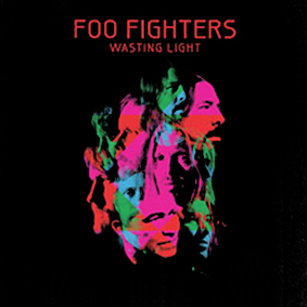
The cover image from the American alternative rock band’s Foo Fighters seventh album called “Wasting Light” can be acclaimed as a seminal piece of design work. The image uses a high contrast of complementary colours in full saturation against a black background to create a vibrant look. This use of colour harmony and the simplicity of the graphic production successfully represent the band’s aim with this album, to simplify and pair back their music in a move away from digital music production.
Symbolic Associations Linked to Colour
Symbolism associated to colour can be hardly described as all-embracing; it may vary depending on individual, cultural and sub-cultural preferences (O’Connor 2010; cited by Arnkil 2008). Thus, the image under consideration can be described from various points of view based around the more western concept of colour harmony. The article “Colour Harmony Revisited” establishes important characteristics around the concept of colour harmony: musical analogy; visual comfort; balance of opposites; geometry or mathematical order; and the similarity or convergence of visual attributes (O’Connor 2010). The article comments musical analogy in the following words: “any arrangement of colours that can be sensed as an orderly combination will be pleasing’’(O’Connor 2010, p.268). Reflecting on this statement, the image can be described as producing a pleasing impression.
The music analogy is highly distinguished in this image. The image uses colours and an aesthetic style often associated with the genre of alternative rock music. In particular, black colour dominating in the image can be often associated with mystery, death, darkness, drama, tragedy, conflict, power, depth, and evil; these notions are often related to rock music; and red can be related to revolutionary ideas and rebellious spirit, virility, aggression, and turmoil (Goldstein 1942). Besides, the image features psychedelic colours which are associated with drug culture in rock music.
There is a balance of opposites evident in this picture. Further to this concept of opposites O’Connor writes (2010, p.268),”colour harmony is based on two key concepts: equilibrium of opposites and the overall unity of overall colour appearance”. It can be concluded that the album artwork achieves an overall unity here through a balance of opposites in both colour and composition. The image presents a well-balanced geometrical composition with its arrangement of faces and the simplicity of its production. Symbolic associations linked to colour can be associated with ideas promoted by alternative rock music; such as, a search for meaning in life, melancholia, drug taking, hedonism and a rebellion against society.
Individual Differences and Colour
The image under consideration can be evaluated through its appeal to young people and people of middle age and the meaning rock music holds for these groups. This image and its colour harmony suggest ideas connected to a search for meaning in life, melancholia, drug taking, hedonism and a rebellion against society and suchlike. In addition, Porter and Mikellides argue that responses to colour have a strong tendency to change over time and may be transformed in accordance to changing social trends (O’Connor 2010). Wise and Wise suggest that humans are not preplanned to colour. In contrast to this Mehrabian suggests that varied stimulus do affect human perception. More specifically, the image can be described as being representative of typical designs in the genre of alternative rock music today. Viewed in a previous era, it may have been less appealing.
Cultural Differences and Colour
Symbolic interactionist theory suggests that humans relate to objects on the basis of the meaning they ascribe to them. This meaning tends to be both arbitrarily as well as culturally defined (Blumer, 1969). Furthermore, in varied cultures colours have different meanings. The picture is accomplished in particular colours reflecting on the notions important in rock culture which establishes its symbolic association of colour and music. Besides, the image features the colour aesthetic which denotes its belonging to particular sub-culture. According to Aslam (2006), in American culture, the colour black means mourning and fear; red symbolizes fear and anger; blue means quality and masculinity; and green suggests good taste. American and western cultural associations of colour can be seen to exist in the Foo Fighter album cover artwork, for example, red may be used here to suggest fear and anger which are emotions often communicated in rock music lyrics. From a cultural point of view the album artwork corresponds to commonly held cultural associations of colour and meaning in the alternative rock industry.
In conclusion, the colour and aesthetic harmony of the image under consideration can be described as well corresponding to commonly held cultural associations of colour and meaning in the alternative rock industry, and thus, can be associated with ideas promoted by alternative rock music including search for meaning in life, melancholia, drug taking, hedonism and a rebellion against society. Additionally, the picture features the graphic production and colour harmony which represent the band’s aim with this album. Finally, the image presents a well-balanced geometrical composition with its arrangement of faces and the simplicity of its production.
References
Aslam, M. M. (2006). Are you selling the right colour? Journal of Marketing Communications, 12(1), 15-30.
Blumer, H. (1969). Symbolic Interactionism: Perspective and Method. Berkeley: University of California Press.
Goldstein, K. (1942). Some experimental observations concerning the influence of colors on the function of the organism. OccupationalTherapy and Rehabilitation, 21, 147–151.
Mehrabian A. (1977). Individual differences in stimulus screening and arous-ability. Journal of Personality, 45:237–250.
O’Connor, Z. (2010). Colour Harmony Revisited. Faculty of Architecture, Design and Planning, University of Sydney, 35(4). 237 – 272.
Wise B., and Wise J. (1988). The human factors of color in environmental design: A critical review. NASA Grant No. NCC 2-404. 40.