Introduction
The Internet has emerged as one of the fundamental highways for information traffic. The level of efficiency at which a website successfully performs its designed function is dependant on its architecture and consequently performance. This calls for the need to constantly evaluate, based on given criteria, the content and performance of a website. Additionally, evaluation offers a unique opportunity for expansion of the existing techniques and the development of new ones where applicable (Yeung & Law, 2006: 463).
It is worth acknowledging that the internet is a ubiquitous medium. This is in the sense that other than the question of affordability, the internet exercises some form of pervasiveness with regard to authorship and audience (Perdue, 2001: 29). The websites fundamentally play the role of international information transformation in addition to their role as a persuasion medium. It is thus vital that evaluation is done with the help of appropriate tools and techniques in order to discern quality websites (Aaberge, et al, 2004:310).
Websites play diverse functions depending on the intention of their developers. Such functions may include personal or biographic data websites, promotional purposes, informational purposes, advocacy/persuasion purposes, instructional agenda, registrations, and finally entertainment purposes (Au Yeung, & Law, 2006:454). The successful usage of a website is thus dependant on the success with which it accomplishes its function (Yeung & Law, 2006: 462). Such success is, however, based on the application of its contents. It may be argued that the summation of the individual components of a website may translate to the success of the given website. This paper examines two websites specifically designed in reference to the 2010 world in South Africa. Both offer information relating to the world cup activities.
Websites
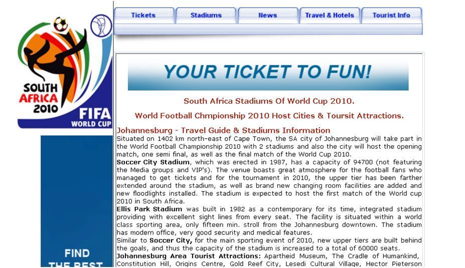
Southafrica trips website
This website’s functions revolve around the 2010 FIFA world cup in South Africa. It uniquely presents an array of information with regard to the world cup, ranging from ticketing, stadiums, and staying reservations. The website’s homepage is illustrated below.
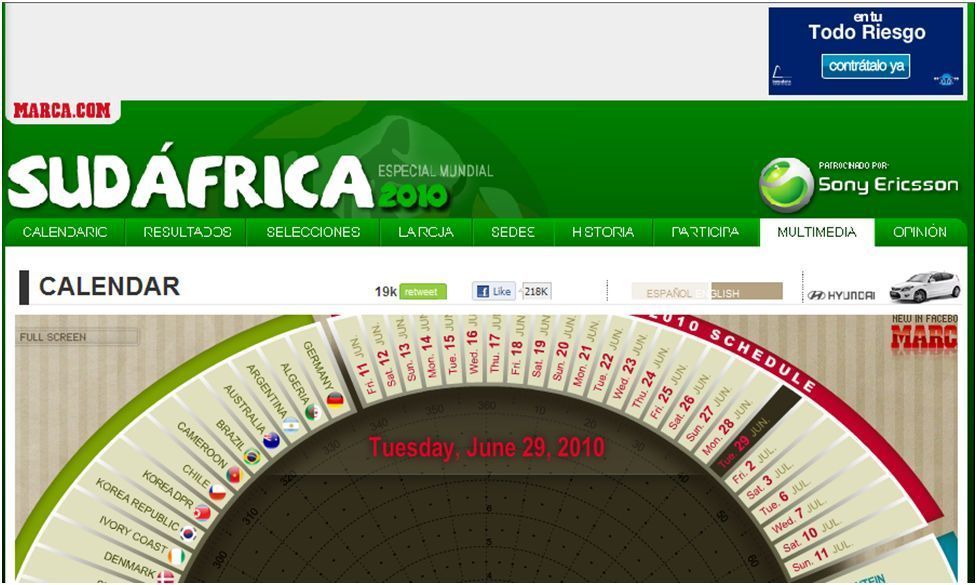
South Africa calendar website
Like the previous website, this one too offers information revolving around the 2010 FIFA world cup. Its homepage screenshot is given below.
Comparison of the two websites
Despite offering similar information, the two websites differ in their approach to the display of information. Comparison of the website will be based on a combination of its branding features, human interaction features, and its usability (Patton, 2002: 11). Various elements have often been suggested that qualitatively analyze websites. The elements enhance and facilitate usability and efficient website functionality.
Homepage’s of the two websites differ in appearance. The southafrica trips website has an appearance that is more official and information oriented. A wealth of information is provided in the homepage with only a few navigational buttons availed. Calendar world website on the other hand is more interactive and user involving. Plenty of navigational buttons that involve the user are present. Information is presented in an interactive way.
Both websites have good visibility features. Southafrica trips website uses very few colors and lesser interactive features making the website a little dull as compared to the calendar world website where a combination of colors mainly primary are applied within its concentric interactive frame. The website is well designed in terms of color, image and animation arrays. However, the southafrica trips website is richer in information and offers plenty of external links that lead tor real pages with real information for those who intended to visit the country for the games. Calendar world website has limited external links on its homepage.
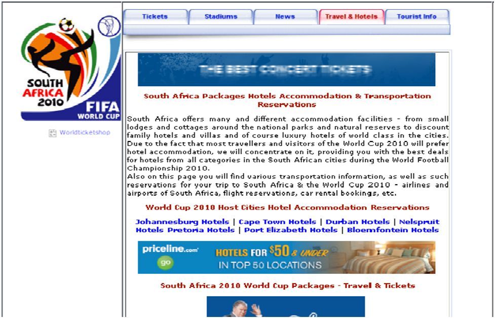
Both sides retain their major navigational icons throughout its pages to enhance transition from one area to another. For instance clicking on the travel and hotels (southafrica trips website) icon leads one into an assortment of hotels and travel agencies of which the present external links leads one to their respective websites. The major icons remain the same even as page transition takes place (see screen shot below)
For the case of calendarworld, navigational keys are plenty and an interactive concentric platform is presented for information access. However, external links are limited and the website concentrates mostly on its internal navigation (see screenshot below).
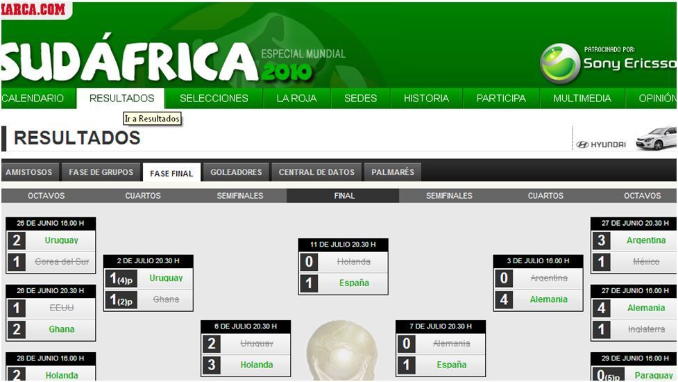
Clicking on the results links one to a page with the games results though the major navigational icons remains the same. However, unlike the home page, internal navigation presents pages that are less aesthetically appealing compared to the homepage. Sub-navigational icons are also present
Both websites are easily accessible with no significant technical hitches experienced. The calendar world website however requires additional software for all its features are to be viewed something that lessens its ease of accessibility more so for those who cannot access the software. Unlike the southafrica trips website, it is best viewed using higher PC’s with approximately 1.2 GHz and 256 MB of RAM. This is given the increased animations it uses. Internet connectivity also needs to be high with at least 112 kb/s preferable. Additional software are necessary for the calendarworld website e.g. adobe flash player. This is not the case for southafrica trips website.
Another area of comparison between the websites is interactivity. Both do not offer an avenue for interaction between its users and the management team or the developers. However, the calendarworld website offers the sites visitors an avenue for making comments through its blog section. Room for personalization e.g. through membership is not offered by either of the sites and hence no such icons are provided. Additional, no search icons are provided making navigation the only way to access information from the sites.
The site’s commercial elements of the two sites also differ. Unlike the case of calendarworld, southafrica trips website offers lost of advertisement through links that director visitors to respective sites where they can obtain more information regarding various services e.g. hotel and travel agencies. The calendarworld on the other hand only offers a few advertisements and instead focuses more on providing information relating to the actual games and participants. In general, southafrica trips website offers a whole package for the intended visitors ranging from accommodation information to travel information.
The table provided below provides a side by side comparison of the elements of the two websites. The table gives information on the website’s accessibility, usability and friendliness with respect to search engines.
Table 1: Technical comparison table of the two websites.
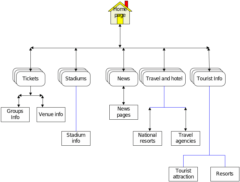
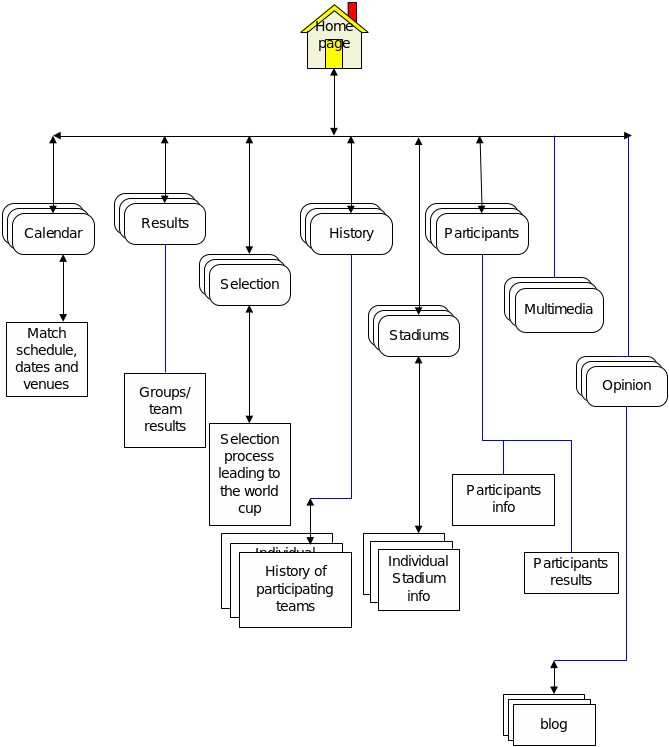
The page block diagrams for the websites are defined below:
References
Aaberge, T. et al. (2004) Evaluation of tourism websites: a theoretical framework. In Frew, A. (Ed.) Information and Communication Technologies in Tourism, pp. 305–317, New York: Springer-Wien.
Au Yeung, T., & Law, R. (2006) Evaluation of usability: a study of hotel websites in Hong Kong. Journal of Hospitality & Tourism Research, 30(4), 452–473.
Patton, S. (2002) Web metrics that matter. CIO Magazine. Web.
Perdue, R. (2001) Internet site evaluations: the influence of behavioral experience, existing images, and selected website characteristics. Journal of Travel & Tourism Marketing, 11(2/3), 21–37.