Data Flow Diagram (DFD) can be a good tool to use when tracking students’ attendance to know those who frequently miss classes. Many colleges have policies defining the maximum number of classes a student can be absent from, and he or she may be dismissed having exceeded this number. CNAQ attendance system can be illustrated through different Data Flow Diagrams. To have the real picture of the data flow system of the class attendance, it would be appropriate, to begin with, the highest level of the data diagram. The top-level data diagram, also known as the highest level of data ranking, gives the general flow of data. Context diagram, top-level diagram show generalized functions of the whole system and the relationship of the other external factors.
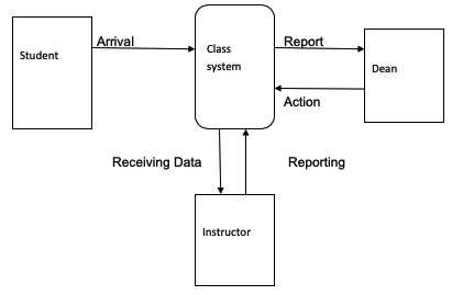
Like in the CNAQ Attendance System Process, there is only one process system represented by an oval shape, as shown in Diagram 1. The process always equals one in the context diagram, and it is placed at the centre like in Diagram 1 it is labelled as a Class System. When the student, who is an external factor, walks in class, the instructor who is also an external factor takes data. The data is entered into the system, and the instructor warns the student after the end of the class. The system involves order verification and isolation of the valid data, which is later sent to the student data store. For the context diagram, only the process and the external factors are shown without many details. The context diagram is mostly preferred because it does not require an understanding of technical knowledge.

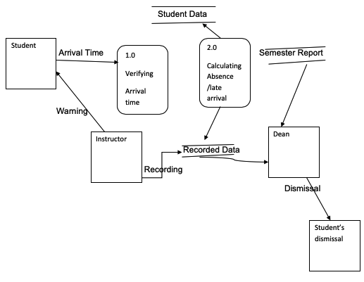
The context level diagram allows people to have an outward view of the data flow without detailed information about what is happening. More detailed information requires the next level diagram, which is called the Level Zero Diagram. Level zero diagrams explode the context diagram to obtained details on the attendance that were not shown in the context diagram. In Zero Diagrams, there are more processes, as shown in Diagram 2. Verifying the arrival time and calculating the number of times a student is present or absent are introduced. The process that was generalized initially as a class system is exploded to give more detailed information. When any student walks in class, the instructor records the arrival time, which will be processed to get the validated data on absenteeism or punctuality.
The instructor informs the student of the danger of being late for class by the end of the class. A report showing the number of times a student has been absent from is presented to the student’s dean at the end of the semester for necessary actions for those students that have fallen above the minimum, which is set as 5 and 10 per cent. The dean dismisses students who happen to have fallen above the 10 per cent policy. Not all the information is explained in the context diagram, and it is not possible to see details of what is taking place within the system. Level zero diagrams are advantageous as they explain the required information in details as opposed to the context level diagram. The disadvantage of the level zero diagram is its complexity and is difficult to draw.

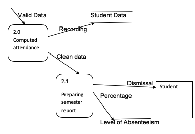
Major functions in tracking class attendance, as seen in the above level Zero diagram, can still be expounded to give more specific information. Trying to add more information on the level zero diagrams gives a new level of the diagram that is called Level One Diagram. More complex functions are split, and more specific functions are introduced to increase the level of understanding. To give the detailed information on CNAQ attendance report, level one is much better as compared to context and level zero diagrams. The diagram below shows how the valid data of students are computed to come up with the number of days attended, and the number of days the student was absent. The computed data are processed than to give the percentages of attended days, and the days the students were absent. The dean is provided with the developed report by the end of the semester. The data generated will be used to either dismiss or retain a student depending on the percentage indicated by data.

In conclusion, the data diagram helps in developing a simple graphical way of representing complex activities that would have been very complex to comprehend. However, the data may undergo several alterations, which may distort the meaning of the diagram. To track absenteeism in colleges using such systems as PeopleSoft and data flow diagrams can become effortless.