The present paper describes and illustrates a dataset that consists of 30 people observed during a one-hour beach walk. The researcher took note of the people’s gender, footwear, and company; the summary is presented in Table 1. MS Excel was used to create all the graphs introduced below. As can be seen from the exercise, Excel offers a variety of graph options that can be employed to illustrate the results of data analyses.
Table 1:A Summary of the Data (Numbers of People in Each Group)
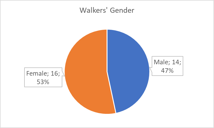
Figure 1 is a pie chart, and it shows male and female walkers as fractions of the entire sample; their numbers are almost equal, but the latter group is slightly more numerous (53% of the sample). A sidebar graph also allows comparing findings for different groups (Richardson-Tench, Nicholson, Taylor, & Kermode, 2018; Williamson & Whittaker, 2017), and it was used to describe the people who wore shoes and those who did not (see Figure 2). The chart shows that most walkers (17) had no shoes.
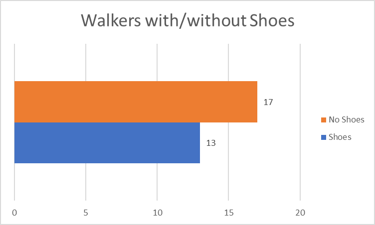
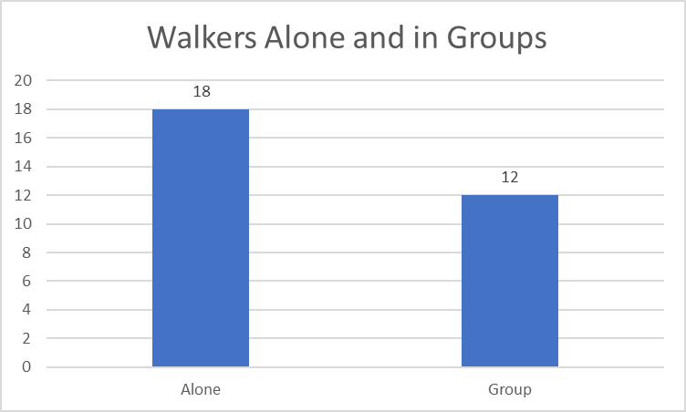
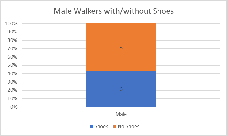
Figure 3 compares the number of people who were walking alone with those who were in groups. A vertical column diagram visually represents the two groups like the sidebar one (Polit & Beck, 2017; Williamson & Whittaker, 2017). Thus, most walkers (18) were alone, but 12 more were walking in groups. Figure 4 is a 100% stacked bar that shows the number of men with and without shoes. Since the two groups are included in another one (men), a 100% stacked bar demonstrates them as parts of the whole, indicating that most men wore shoes (eight people as compared to the six who wore them).
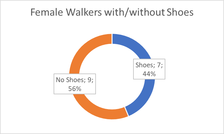
Furthermore, a doughnut chart was used to represent the female walkers with shoes and female walkers without shoes (see Figure 5). There is not much difference between the pie chart and the doughnut chart; they show groups as parts of a whole, and additional labels include the data about numbers and percentages. As can be seen from the chart, 56% of the women in the sample wore no shoes.
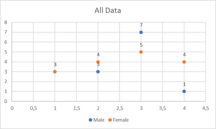
Since the task requires introducing a plot graph as well, one was used to describe the data with all the variables added. However, this approach may be inappropriate since scatterplots usually represent numerical variables (Williamson & Whittaker, 2017). The variables from the current dataset are not numerical because they use nominal data (Polit & Beck, 2017). The chart above (see Figure 6) uses the numbers of people in every group to form a scatterplot, but it is better to introduce a different graph to describe the entirety of the data.
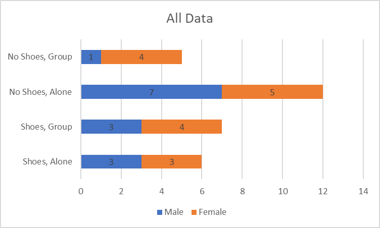
Figure 7 presents all the data using a stacked bar graph. In it, different colors are designated for different genders, and four other categories are introduced to represent the entirety of the groups within the sample. Thus, Figure 7 shows that the people who wore shoes and were alone turned out to be the most numerous group. Also, it indicates that most of the described groups had roughly similar numbers of men and women, but among the people who wore no shoes and did not walk alone, women outnumbered men four to one. To summarize, the described dataset can be illustrated through a number of different graphs which present particular opportunities for drawing attention to patterns within it.
References
Polit, D.F., & Beck, C.T. (2017). Nursing research: Generating and assessing evidence for nursing practice (10th ed.). Philadelphia, PA: Lippincott, Williams & Wilkins.
Richardson-Tench, M., Nicholson, P., Taylor, B., & Kermode, S. (2018). Research in nursing, midwifery and allied health: Evidence for best practice (6th ed.). New York, NY: Cengage AU.
Williamson, G. R., & Whittaker, A. (2017). Succeeding in literature reviews and research project plans for nursing students. Thousand Oaks, CA: Learning Matters.