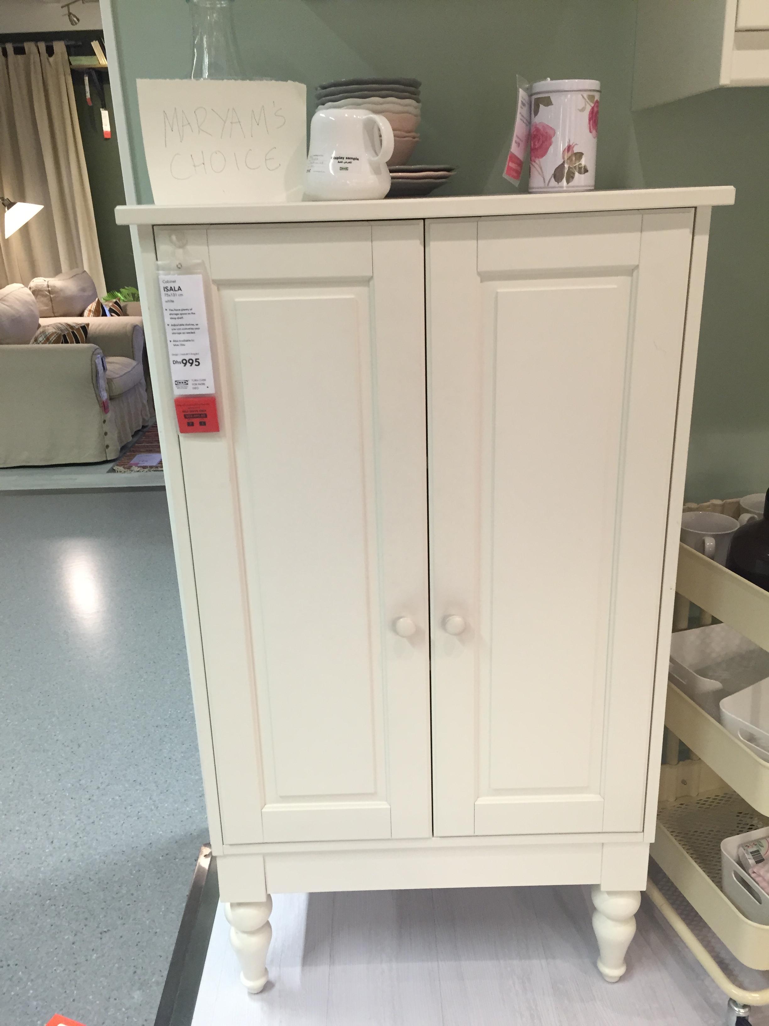
The piece of furniture selected for the review in this paper is a cabinet found in IKEA. The item is called Isala cabinet. It was designed by Johanna Asshoff and Hanna Brogard of Asshoff & Brogard Designstudio. Both designers were born and raised in Sweden. After obtaining professional education they both practiced interior and furniture design working in different companies. After that, they started to collaborate and created their design studio. Today they work with a great number of Swedish and international clients. Isala cabinet was designed in Stockholm, Sweden. The approximate time when the cabinet first saw the world is the beginning of the 1990s.
Isala cabinet has mostly straight lines and rigid edges, it is symmetric and of a rather simple shape. The proportions of the cabinet slightly resemble Jacobean furniture, yet the cabinet belongs to the Scandinavian contemporary style of furniture. Isala cabinet is 75 cm wide, its height is 131 cm and it is 44 cm deep. The cabinet is made of fiberboard and plastic and covered in acrylic paint. The item comes in three colors: white, lilac, and blue. This piece of contemporary furniture is rather functional as it has plenty of storage space valuable by any owner. Besides, its shelves can be adjusted so that the customer can shape the inner space of the cabinet according to their specific requirements. Moreover, the simple, yet classic exterior of the item makes it aesthetically suitable for a great variety of different households. The simple and plain cabinet would fit into any interior without clashing with it. There is a very noticeable difference between the furniture design specific to the Victorian era and the Isala cabinet. The victorian era covered most of the 19th century and is recognized for the revival of medieval and Gothic design styles in furniture (Meggs & Purvis, 2011).
Victorian items had heavily carved decorations and a lot of details, curvy and wavy lines emphasized by the elaborate carving (The Victorian Era, 2014). Isala cabinet’s decorations are minimal, its shape is balanced, and its lines and straight. Besides, it comes in light colors, whereas Victorian furniture was mostly dark. Such design makes it more suitable for a modern home, which is its main advantage since in contemporary interior design plain and correct forms prevail. The only part of the cabinet that could be compared to the features typical for Victorian furniture is the legs which are decorated with turning.
Isala cabinet was chosen for this review paper because, in my opinion, this item is an excellent demonstration of what contemporary consumers prefer. The cabinet serves as an illustration of the evolution of tastes. Back in the 19th century advanced carving and plentiful decorations were popular due to the newly occurring technological progress and general adoption and recognition of it (Meggs & Purvis, 2011). Today, technological progress has gone much farther, yet we appreciate simple shapes. Isala cabinet fits the main requirements of the modern buyer – flexibility, universality, customization possibility, and practicality.

Reference List
Meggs, P. B. & Purvis, A. W. (2011). Meggs’ History of Graphic Design. Hoboken, NJ: Wiley & Sons.
The Victorian Era. (2014). WordPress. Web.