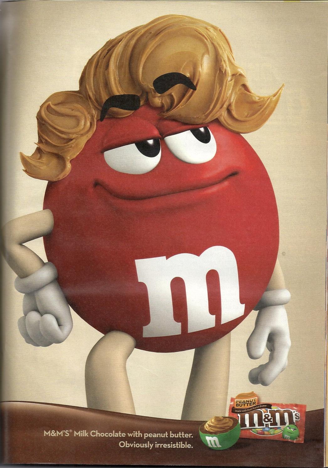
Despite its seeming simplicity, the recent commercial created by the M&Ms Company and featuring its mascot with a hairdo has gained numerous responses. In order to make the two elements (i.e., peanut butter and the M&M mascot) compatible, the organization had to make a range of compromises, the color cast being the most obvious one. Indeed. In contrast to the traditional choice of bright colors, the designer decided to shift the palette towards a more restrained saturation of the objects.
While the given decision clearly is a compromise between the bright color of the M&M mascot and comparatively dull color of peanut butter, the solution that the designer came up with is, in fact, very clever.
By shifting the palette into the sepia-tone area and creating the hairdo that could make the audience view the character as not merely edible, but delicious, with every single detail conveying the message of tasting the candy and even its smile inviting to try and eat it. Thus, the image represents a novelty, deliciousness, and unique experience.

The allusion to the first peanut butter M&Ms commercial ever released on TV can be seen clearly in Picture 1. Indeed, the hairdo in the advertisement provided above bears an obvious resemblance to the characters created in the ones that were designed for the early 90s commercial (M&Ms Commercials 00:00:16).
However, unlike in the commercial in question, where the hairdo was toned down and the emphasis lied on the product, Picture 1 features the image that can be referred to as nearly a parody of the original idea, the concept that has been blown entirely out of proportions; hence the hilarity thereof.
The use of form can also be described as rather elaborate and even cautious. Seeing that most of the elements in the advertisement have a round shape and very clear outlines, it can be assumed that the form in the specified piece follows function in its entirety.
Particularly, the form relieves the picture of extra details that could distract the viewer’s attention and helps focus on the key message, i.e., the combination of an innovative approach and the traditions that have made the company a household name and its products timeless classics of sweets. In fact, the above-mentioned approach aligns with the key tenets of the theory suggested by Sullivan, who claimed that form must follow function (Lidwel et al. 125).
Assuming that “The form follows function corollary is interpreted in one of two ways—as a description of beauty or a prescription for beauty” (Lidwel et al.106), the theoretical tenet in question sheds light on the reserved use of angular forms in the commercial as the means to create the impression of comfort and, thus, get into the good graces of the target audience.
Additionally, the posture of the character says much about the key message that the designer attempts at getting across. The posture and the facial expression of the character show his confidence, even his hands being fold in a self-assured manner. As if trying to say, “Come and eat me!” the character incorporates the key idea of trying a new experience and tasting something unusual.
As a result, every single detail of the image works for the benefit of the commercial, inviting the target audience to taste the new flavor of M&M. The smile and the eyebrows, which add to the overall impression of the audience being challenged, turn the above-mentioned advertisement into marketing perfection,
Another characteristic element of the commercial, which falls into the eye of the viewer immediately, is the absence of any human characters in it. While the commercial features a character that has been humanized in order to establish a connection between the mascot and the target audience, it still clearly lacks actual human characters.
The reason for the seemingly weird choice of avoiding including human characters into the commercial can be explained by the fact that the designers of the image may have aimed at creating the M&M mascot that the viewers could connect easily with.
Indeed, with no other elements to distract people’s attention, including side characters, the image allows the viewers to focus on the product, i.e., the chocolate drops. Likewise, the text added below, saying, “M&M’S Milk Chocolate with peanut butter. Obviously, irresistible” (“Example of Simple Association” fig. 1) was made as small as possible to reduce the amount of distracting elements to zero.
Despite the fact that the image created by the M&Ms Company in order to promote the new flavor of the famous chocolate drops can be interpreted as a rather basic choice in terms of both marketing and graphics, the combination of the a charismatic character and an original idea of a peanut butter hairdo wins the hearts of the target customers owing to its simplistic charm.
The message that the image in question sends to the target audience, therefore, becomes all the more powerful due to the lack of hidden innuendoes and its straightforwardness. The marketing choice that allows for retaining the recognizable mascot and at the same time, updating the company’s brand product, the image under analysis is both enticing and refreshing.
Works Cited
“Example of Simple Association.” WordPress. 2013. Web.
Lidwel, William, Kristina Holden and Jill Butler. Universal Principles of Design, Revised and Updated: 125 Ways to Enhance Usability, Influence Perception, Increase Appeal, Make Better Design Decisions. Beverley, MA: Rockport Publishers, 2010. Print.
M&Ms Commercials. “M&M’s – Peanut Butter (Early 90’s).” YouTube. 2009. Web.