Deep meanings hidden in advertisements are usually revealed to the audience with the help of provocative visuals that attract the attention and make the public think about the real meaning of the image. The advertisements created by the Child Health Foundation and the Chilean Corporation Against Cancer are the part of anti-smoking campaigns, and they demonstrate the hazards of second-hand smoking. To discuss the strategies and meanings accentuated in the advertisements, it is important to focus on comparing and contrasting the advertisements’ details. Although second-hand smoking is often described as the non-harmful process, the advertisements present vivid images of children who are negatively influenced by passive smoking to draw the public’s attention to the fact that parent smoking can kill children.
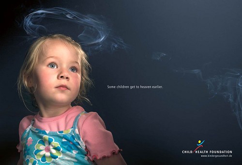
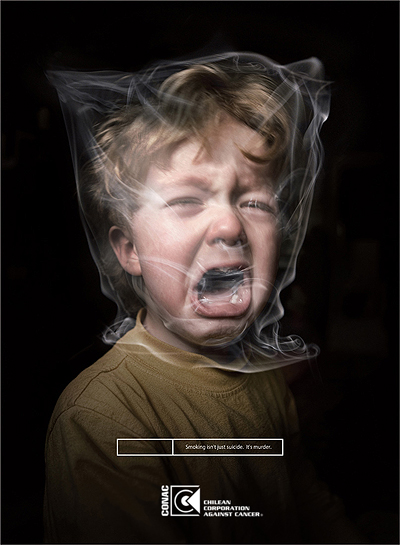
The advertisement created by the Child Health Foundation represents a young, innocent girl in bright clothes and with blond curly hair who has the smoke nimbus over her head. The girl is depicted at the dark blue background on the left side of the picture. The innocence of the girl is accentuated with her pensive look of an angel and the eye-catching facial expression that emphasizes her fear of unknown. Moreover, the unusual halo over the head seems to be the result of someone’s smoking at a distance. Thus, this nimbus is the most impressive element that attracts the public’s attention because of its rather provocative smoke origin (Picture 1; “Child Health Foundation”). The advertisement created by the Chilean Corporation Against Cancer presents a crying boy with curly hair who suffers in the trap of the smoke.

The image of the boy caught by the smoke is in the center of the picture, and it is in contrast with the deep black background. The boy’s face expresses significant sufferings, agony, and fear because he cannot escape from the trap of the smoke, and this fact makes the audience sympathize for the child (Picture 2; “Chilean Corporation Against Cancer”). Thus, the target audience of these advertisements is the parents who do not think about the problem of second-hand smoking, although this habit can cause their children’s deaths. That is why the advertisements aim to attract the parents’ attention to this problem as the real threat to their children’s health while focusing on the images of an innocent and vulnerable girl and a boy whose life is at risk because of parent smoking.

While focusing on the characters and symbols presented in the advertisements, it is necessary to discuss the advertisements’ primary strategy. The goal of the discussed advertisements is to inform parents about the fatal risks of second-hand smoking for children. If a parent smokes, the child’s life becomes shorter because the smoke affects the child’s health significantly. The problem is in the fact that an innocent child is often an angel who cannot control or avoid the effects of parent smoking. That is why, while smoking, parents kill their children. The advertisements are developed to present this message in the most shocking manner with the help of vivid and provocative images to inform the parents about the fatal risks (Du Plessis 24). Thus, the innocent girl and crying boy seem to scream for help figuratively and literally.
The message can be understood by the audience clearly because of the definite rhetoric strategies used in the advertisements. To create the thought-provoking message, the authors of the advertisements use such rhetoric strategies as the analogy and pathos. The analogy is used to make the audience think about the presented objects in a certain way (Howe, Johnson, and Edelstein 114). Thus, the viewer creates the analogy relations in his or her mind while seeing a young girl with the blond curly hair and a nimbus. While focusing on the other advertisement, the viewer is inclined to see the smoke round the boy’s head as the bag preventing the child from breathing.
The analogy relations are emphasized with the help of using such rhetoric appeals as the pathos (Gooch and Seyler 20-38). The emotional appeal is created by depicting the helpless children who cannot avoid the situation of being killed by the smoke of their parents’ cigarettes. Thus, the images of the innocent girl and boy who are at risk of dying from the second-hand smoking effects make the audience think about moral values and feel fear and sadness (“Child Health Foundation”; “Chilean Corporation Against Cancer”).
Second-hand smoking can kill children, and smoking parents should know this information to make their conclusions. This message becomes clearer while referring to the advertisements’ print parts. In this case, the organizations’ logos add to the advertisements’ credibility when the slogans add to the advertisements’ meaning. The Child Health Foundation accompanies the advertisement with the text: “Some children get to heaven earlier” (“Child Health Foundation”). This text aims to explain the nimbus appearing over the girl’s head and her resemblance to an angel. The viewer can see the obvious connection between the cigarettes’ smoke and the child who becomes an angel after her death.
This relation between the visual and the text makes the viewer use the imagination and react to the advertisement after revealing all the hidden meanings. The text used by the Chilean Corporation Against Cancer is rather concrete: “Smoking isn’t just suicide. It’s murder” (“Chilean Corporation Against Cancer”). This message leaves little rest for searching for the hidden meanings because of providing the concrete idea that the second-hand smoking kills children, and the image of the crying boy supports this idea. As a result, this slogan appeals to the audience’s strong negative reaction to the text and the described situation.
Nevertheless, to understand the advertisements’ meaning clearly, it is necessary to refer to the overall visual impression influenced by the authors’ use of colors and images in their combination. The young girl looks like an angel because she has the blond curly hair, her cheeks are rosy, and her gaze is innocent. This bright image is in contrast with the dark blue background and provocative text. As a result, the opposition between the image of an angel and the reality of smoking is accentuated with the help of using contrasting colors. The visual evokes the viewer’s emotions of fear and unease because of the observed threat of death (Picture 1). The color scheme of the second advertisement is also contrasting because of using only light-brown and black colors. Thus, the audience becomes aware of all the threats of smoking while looking at this image because of concentrating on the child’s obvious sufferings accentuated with the help of contrasting colors (Picture 2).
The discussed advertisements designed by the Child Health Foundation and the Chilean Corporation Against Cancer convey the controversial idea that parent second-hand smoking can kill their children. This message is expressed with the help of providing thought-provoking images of children who look like angels, and who are helpless to avoid the dangerous smoke and its fatal effects. The focus on the analogy and the pathos to present the idea helps the advertisements communicate the message about the second-hand smoking effects on the target audience effectively.
Works Cited
Child Health Foundation. n.d. Web.
Chilean Corporation Against Cancer. n.d. Web.
Du Plessis, Erik. The Advertised Mind: Ground-breaking Insights into How Our Brains Respond to Advertising. USA: Kogan Page Publishers, 2005. Print.
Gooch, John, and Dorothy Seyler. Argument ! USA: McGraw-Hill. Print.
Howe, Katherine, Mary Lou Johnson, and Judith Edelstein. Understanding Advertising. USA: Prufrock Press Inc., 2000. Print.