The works of Van Gogh and his use of color have often been studied chronologically demonstrating the shift in his usage of colors from his early paintings, which were dark and pessimistic, to the paintings of his mature career, where he has used lighter tones and brighter colors.
In the later stage, Van Gogh made a distinct use of complementary color scheme, which was a definite shift from the classical treatment of colors. This paper will compare and contrast two paintings, The Sower and The Night Café, and demonstrate the distinct style Van Gogh followed to use color for his paintings.
Expressive use of colors in distinctive complementary schemes has dominated many of the masterpieces created by Van Gogh. His correspondences to his brother during the 1882-85 demonstrate his obsession with the use of color in his work.
They demonstrate that Van Gogh’s concern and distinction between shades, tones, hue, and brightness of color, which formed the psychological basis of colors and themes of his paintings. The use of complementary colors, which became the signature of Van Gogh’s style, helped to intensify the mutual effect of the color scheme in the paintings. Van Gogh used basic colors and contrasting hues to increase firmness and depth of his paintings:
These things that are relevant to complementary colors, to the simultaneous contrasting and the mutual devaluation of complementary colors, are the first and most important issue: the second is the mutual influence of two similar colors, such as carmine and vermilion, or a pink-lilac and a blue-lilac. (Van Gogh Letter # 428, dated Oct. 1885. (Bekker and Bekker)
The use of primary colors and the use of their complementary colors, also known as secondary colors, is a basic technique used for impressionistic painting. When a primary color is put against a complementary color, it creates a contrasting color scheme, creating a powerful effect.
Van Gogh exploited this technique of creating a strong effect in his painting through juxtaposition of primary and complementary colors. Van Gogh’s fascination for complementary colors intensified as he shifted his focus from Dutch style to paintings that are more impressionistic.
Gayford (179) demonstrates Van Gogh’s heightened interest in colors, which created a symbolic language for the maestro. In another correspondence to his brother Theo, Van Gogh expressed his increasing obsession with colors: “Yesterday evening an extraordinary beautiful sunset of a mysterious, sickly citron color – Prussian blue cypresses against trees with dead leaves in all sorts of broken tones without any speckling with bright greens.” (Gayford 179)
Thus, colors create a symbolic language for Van Gogh, which helped his to determine the effect that wanted to create in his paintings. Given this understanding of Van Gogh’s philosophy of color, the essay then moves on to analyze two of his paintings and the treatment of colors in them.
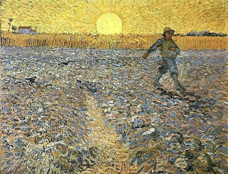
The Sower demonstrates a man striding across a wheat field, with outstretched arms, appear in many of Van Gogh’s paintings and sketches. Philosophically, it has often been interpreted as the renewal of life; however, in this essay we will discuss the use of complementary color scheme of the paintings.
The particular picture that is discussed in this essay was painted in 1888, which stands out from all other paintings of sowers and creates a unique impressionistic creation of the cycle life in full summer (The Sower is shown in figure 1 below).
Figure 1: The Sower, 1888

The Sower, painted predominately in yellow and violet demonstrates the use of complementary colors by Van Gogh. Yellow is a primary color that is positioned against violet, one of its complements, and a mix of the other two primary colors, red and blue. Even though artists had knowledge of the effect two complementary colors could create, no one before Van Gogh experimented with it.
Primary colors, when juxtaposed with complementary colors, create a vibration and magnificence that is otherwise unattainable. Hence, when yellow is used against violet, it creates greater brightness and pureness of color than when painted with any other colors. Similarly, violet seems more lively and vigorous when put against yellow.
The Sower was painted when Van Gogh was living in Arles, in June 1888. The original Sower by Millet from which Van Gogh drew inspiration or his Sower believed that Millet created a painting in “colorless gray” and wanted to create a painting of the sower with colors (Bekker and Bekker).
In order to understand color contrast, consider putting orange against blue and orange against green. Orange is blue’s complement where blue is a primary color and orange is a secondary color created through mixing of the other two primary, red and yellow. Hence, the effect of brightness when orange and blue are used together is greater than when orange and green are used, wherein both are secondary colors. Moreover, the orange when put with green seem darker, almost a different color.
Hence, it can be observed that colors can change their hue and brightness depending on the colors with which they are used. Moreover, colors cannot be used singularly, without considering the other colors that are used. Colors cannot be judged in isolation. Hence, it is important to understand what colors are used along with the others and what affect it creates in the paintings. Knowledge of colors becomes the most important factor while studying Van Gogh’s form so impressionistic painting.
The painting of the yellow and violet together as an expression of light and darkness in the field is an extreme example of use of complementary colors in paintings. This helped in intensifying the brightness, saturation, and depth of the painting.
Van Gogh described his 1888 creation inspired from Millet’s painting, in one of his letters, as “painting from Millet’s drawings is more like translating them into another language than copying them” (Metzger and Walther 272). The colors used in the painting became reminiscent of his emotions and feelings. The colors demonstrated the dominant mood of the painter.
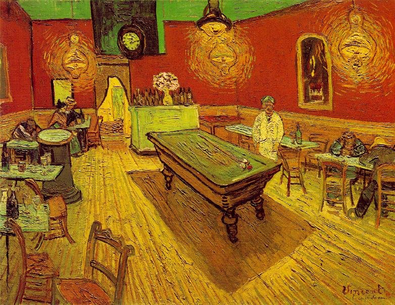
The Night Café is a poetic expression through colors, which demonstrates the harsher realities of modern life. Van Gogh’s obsession with colors intensified from 1885 until his death in 1890, resonant in his letters to his brother Theo. Each of the letters is evocative of the saturation, hue, and intensity of the colors from his palette. In describing the Night Café (figure 2) in his letter to Theo, Van Gogh associates passion with the use of two complementary colors – red and green:
I’ve tried to express the terrible passions of humanity with red and green. The room is blood red and dull yellow, with a green billiard table in the middle; there are four lemon yellow lamps casting an orange and green glow… In my picture of the night café, I’ve tried to convey the sense that the café is a place where one goes to ruin goes mad, commits crimes.
I’ve tried to express the powers of darkness, in a way, in this dive of a bar, through contrasts of delicate pink, blood red, wine red, and soft Louis XV green and Veronese green, in contrast with hard green-yellows and blue-greens – all this amid an infernal furnace of pale sulphur. (Letter#533, Bekker and Bekker)
The above description of the painting as expressed through Van Gogh’s words demonstrate the use of complementary colors in the painting, and the reason for the sue of the colors in their complementary best. Life’s juxtaposition is expressed through the oppositions of color that makes life as well as his paintings so pulsating.
In the Night Café Van Gogh has expressed the struggle of life through the juxtaposition of the two complementary colors – red and green. The violet and blue used in the painting depicts sadness and dreariness of modern nightlife, and
Figure 2: The Night Café

The painting shows maximum saturation of colors, where colors like red and green has been used without any hint of tint or shade. In the Night Café, Van Gogh used color in its purest form against its equally pure complementary. This is not seen in The Sower, where the colors were used symbolically, but not its purest hue.
The use of original hue in the Night Café sets is apart from other paintings, even though the technique used in both the pictures are similar. Nevertheless, both the picture reverberates with the infernal furnace of life though the use of yellow, which has been used to depict the sun in The Sower and the lamps in The Night Café. The difference between the two paintings is that the first is a depiction of continuity of life while that of the café describes a hellish existence.
Works Cited
Bekker, K.G. and A.Y. Bekker. 2009. “Color and Emotion — a Psychophysical Analysis of Van Gogh’s Work.” 2009. PsyArt. Web.
Gayford, Martin. The Yellow House.:Van Gogh, Gauguin and Nine Turbulent Weeks Provence. New York: Houghton Mifflin Company, 2006. Print.
Metzger, Rainer and Ingo F. Walther. Van Gogh. Berlin: Taschen, 2008. Print.