Introduction
The wireframe for the fictional marine conservation is designed to create campaign awareness among people between 18 and 25 years old. The design contains several features that can help reach the target audience and pass the required information. The most important features include images, statistics, a call to action, contact details, and about the website. These features are necessary for the website as they will help deliver the website’s objectives which include creating awareness of the plastic amount that pollutes the ocean, creating awareness for damage caused by plastic to the ocean, and encouraging consumers to sign up for email newsletters. Different features used to design the website can also be discussed in other website-building platforms such as Squarespace and Wix.
Website Features

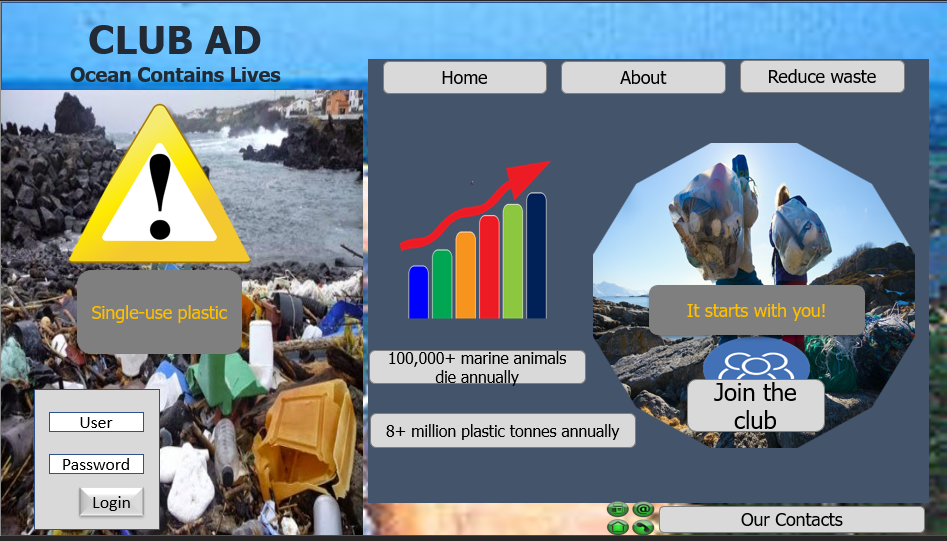
Within the wireframe design in figure 1, images have captured more space and can convey more than the words used. The current digital trends often use images when passing information and making advertisements (Jiménez-Sánchez et al., 2021). On many occasions, the images used provide simple text summaries and graphic communication, as well as Search Engine Optimization for different business websites (Vavilova, 2022). Including images as part of a key feature of the awareness website design is a good choice that corresponds to the current digital trends and fits the interests of most online platform users. Every day, 7.2 billion images get shared online, with many of them mentioning companies without using any words (Dootson, 2020). Because current Internet users spend more time sharing or resharing photographs, visitors can garner attention faster by providing a captivating image with key information.
Images are important in awareness campaigns since they attract the viewer’s attention. According to Dootson (2020), individuals recall 80 percent of what they see but only 20 percent of what they read. Images that are relevant to the user improve the user experience (Mohamed et al., 2022). They give a contextual message that addresses the information gap. In the wireframe design in figure 1 above, two images are used, one in the background and the other in the foreground. The image in the background help in attracting the website visitor’s attention to what the website is about. The second image in the foreground diverts visitors’ attention with a need to view more about the information contained within the website. One of the objectives is to raise awareness about the ocean pollution caused by plastics; the picture helps capture the main issue. The image portrays a bad view of the ocean’s shores; when viewed by the website visitor, they will feel an emotional link to the image and know it is not right.
The target users are people aged 18 to 25 years old. This target group enjoys recreation and conducting business along the coastal beaches. With a postal beach polluted with many plastics and other forms of pollution, the named activities cannot be possible thus affecting the target audience economically and Healthwise. Polluted beaches full of plastic waste cannot be used for recreational purposes such as swimming and skateboarding, nor can people conduct businesses around the area (Pathak, 2020). Using an image that displays the polluted region helps reach the target user’s needs and thus will make them interested in being involved in the campaign to restore better ocean and beach conditions. Contaminated beach water causes illness in swimmers. Thus, when a user needs to use the beach in its better and perfect conditions, a picture of a heavily littered beach will attract the viewer’s interest, and they will have thoughts of making changes to avoid such from happening.
A call to action (CTA)

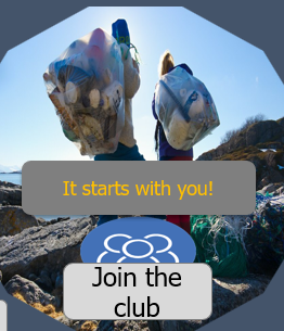
Most contents displayed in the current digital trends have a call to action (CTA), from social media postings to publications to website advertisements to static landing sites. This has become a strong element of the marketing engine as people have adopted many ways of using CTA. The examples of the CTAs currently used include “Grab yours before the offer is over,” “Follow us on Twitter,” “Call Now,” and “Don’t be left out” (Caruelle, et al., 2019). When they are used, they act as a direct means to convey the company’s objectives. CTA, as used in this website design, attracts, and invites the audience to take more interest in the information shared (Brownbill et al., 2018). The choice to include CTA in the design is to try to convince the target audience and advise them to join the ocean conservation group.
As shown in figure 2, the call to action helps meet the client’s objective by creating an invitation channel where most users can sign up and participate in the awareness campaign to save the ocean from plastic pollution. The CTA used in the website design helps the client to reach new audiences, creates an easier way of interaction, and provides a greater reach (Jung et al., 2020). Through named ways, once the audience joins the club via the CTA, they will receive either a weekly or monthly newsletter from the client. The newsletters can contain helpful information and guidelines to help the audience take more responsibility for saving the ocean from plastic pollution.
Research indicates that 91 percent of people who sign up to receive awareness or advertisement newsletters open their inboxes at least once a day. Of the number of people who read the newsletters, 95 percent find them helpful (Ang et al., 2021). Connecting these statistics to the website design feature in figure 2, CTA will be useful and positively achieve the client’s objectives.
The target users are still new to the business world and enjoy recreational activities. This group will not be happy when places they can find such opportunities are unconditional or closed due to plastic pollution. By using a call to action to invite the audience to sign up and receive newsletters, the audience might be interested in participating (Verlegh et al., 2018). After subscription or joining the club, informative newsletters will be sent to them, providing useful information that can be applied. All of the possible and relatable information useful in preventing plastic pollution in the ocean would be made possible and easier by using a call-to-action feature on the website.
Statistics

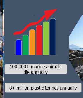
People in the current world of technology rely on statistics to determine the effectiveness of a given product, service, or information. Including statistics within the website design is necessary since it is an effective marketing tool that allows businesses, organizations, and the target audience to make smart judgments about effectively selling or buying any product or service (Kootenaie and Kootenaie, 2021). Statistics are simple estimations based on numerical analysis of data. They are only estimations based on the information available. Before making important decisions within digital platforms, people often google information to rely on facts or important data before making their minds (Bridges, 2021). With the statistics already included on the website, such decisions can be made easily based on what the website visitor needs. Therefore, for a person to be fully influenced, statistics included within the website, as shown in figure 3, are critical in this procedure.
Including website design statistics helps meet the client’s objective of creating awareness of the damage caused to the ocean and its future. The statistics indicate the amount of damage the animals in the ocean suffer from pollution from waste such as plastics. Additionally, the statistics show how much plastics get thrown into the ocean yearly. When a stop or control is not made to the current status of plastic wastes thrown in the ocean, the statistics data will continue to grow to create more effects. With the information put for the target audience, they will rethink the future and make better decisions toward promoting a clean ocean environment.
The statistics also cater to the target user’s needs by showing them data on the current state caused by plastic pollution in the ocean. The statistics show that people throw over 8 million tons of plastic into the ocean yearly. The target audience can use the information and decide by estimating how the future of the coastal beaches will look, provided no actions are taken to control plastic pollution (Ungerman and Dědková, 2019). The statistics appeal to the audience to take personal responsibility to save the ocean’s future, a place that most of them use for business and recreation. Additionally, the statistics indicate that over ten thousand marine animals are killed due to plastic pollution. Some of these marine animals are human food, but when plastic pollution is not controlled, the future might leave none. Similarly, the target audience is convinced by the information to start making choices that favor marine animals.
Comparison of platforms: Squarespace vs. Wix
Squarespace and Wix are the two most popular website builders by far. They collectively power 55 percent of webpages created using a website builder (Forbes, 2019). While these two website builders are both popular, they have significant variances.
Flexibility of Features
With Wix, users can freely move any element to any location they want on their page, which applies to even one pixel at a time. This way, it is a free-form editor that provides flexibility (Forbes, 2019). It seems liberating to move an element wherever on a page, but it may also result in issues that a user might find irritating. For example, a user has to do the identical modification twice: the first for the desktop and the second for the mobile version.
The editing system for Squarespace consists of sections constructed one after the other. After that, there are blocks that provide material for the sections. A user cannot freely move an element on a Squarespace page like in Wix (Bruni, 2022). However, Squarespace allows the user to only drag website elements or blocks into columns and rows. There is a natural and rational framework that a user adheres to when using Squarespace, making it less flexible (Drapkin, 2022). On the other hand, Squarespace does not have the issue of designing twice because it has an organized editor.
Blogging
Squarespace offers the finest blogging experience than Wix website builder. If the site’s primary aim is blogging, then a user can opt for Squarespace. Squarespace offers a wide range of functionality, including tagging, comments, categories, user roles, categories, and Google AMP (Carney, 2022). Furthermore, in addition to these essential capabilities, Squarespace supports teams, allowing users to have collaborators with different responsibilities, such as comment moderation and several writers on a single article.
On the other hand, Wix also provides blogging but not to the extent of Squarespace. Even though it has expanded the number of blocks available in its editor, several functions, like social media bars and moderation are still missing (Hennigan and Watts, 2022). The comments option is a significant disadvantage of Wix’s blogging features. Users cannot pre-moderate new comments; they will display on their sites immediately. Furthermore, commentators must first register with the respective websites before commenting.
Templates
Squarespace’s templates are more up-to-date and better than those for Wix. Squarespace also allows for more template customization (Benjamins, 2020). It is considerably easier to use brand colors uniformly across the website. Wix, on the other hand, makes color selection complicated and tough. Users must select colors for each part, which is far more difficult (Benjamins, 2020).
When choosing a better platform, Squarespace would be better than Wix. Even though Wix is more flexible in editing features, Squarespace offers more grouped information that can be moved at once and does not change based on the devices used (Singleton, 2022). Squarespace also provides the best design and modern templates, plus extra blogging features that make both personal and commercial use easier than when compared to Wix.
Conclusion
The design features used in building the awareness website wireframe are not far from the features available in Squarespace and Wix. Knowing more about different aspects of building a website based on user requirements is essential since it helps create a perfect site that matches objectives, client needs, and audience needs. When comparing website builders for a given website, users should compare available websites based on templates, ease of use, flexibility, blogging, pricing, and commercial features. When these are properly weighed based on user needs, the best website builder can be picked.
References
Ang, D., Gerrath, M.H.E.E. and Liu, Y. (2021) ‘How scarcity and thinking styles boost referral effectiveness’, Psychology &Amp; Marketing, 38(11), pp. 1928–1941. Web.
Benjamins, S. (2020) ‘Wix vs Squarespace: 6 Crucial Differences To Know.’ Sitebuilderreport. Web.
Bridges, E., (2021). ‘The undergraduate marketing research course: Two decades of change.’ Journal of Marketing Education, 43(3), pp.285-297. Web.
Brownbill, A.L., Miller, C.L. and Braunack-Mayer, A.J. (2018) ‘The marketing of sugar-sweetened beverages to young people on Facebook’, Australian and New Zealand Journal of Public Health, 42(4), pp. 354–360. Web.
Bruni, E. (2022) ‘Wix vs Squarespace 2022: Is the Popular Choice Really Better?‘ Website Planet. Web.
Caruelle, D., Gustafsson, A., Shams, P. and Lervik-Olsen, L., (2019) ‘The use of electrodermal activity (EDA) measurement to understand consumer emotions – A literature review and a call for action’, Journal of Business Research, 104, pp. 146–160. Web.
Dootson, P. (2020) ‘3.2 billion images and 720,000 hours of video are shared online daily. Can you sort real from fake?‘ QUT. Web.
Drapkin, A. (2022) ‘Wix vs Squarespace: Wix and Squarespace offer excellent features at enticing prices. We split the hairs to help you choose between them.’ Websitebuilders. Web.
Forbes, J., (2019). ‘Web Builders and the Future of the Web Development Industry.’ Forbes. Web.
Hennigan, L. and Watts, R. (2022) ‘Wix Vs. Squarespace (2022 Comparison)‘ Forbes. Web.
Jiménez-Sánchez, Á., Margalina, V.-M. and Vayas-Ruiz, E. (2021) ‘Governmental Communication and Brand Advertising During the COVID-19 Pandemic’, Tripodos, 2(47), pp. 29–46. Web.
Jung, J. et al. (2020) ‘Words Matter! Toward a Prosocial Call-to-Action for Online Referral: Evidence from Two Field Experiments’, Information Systems Research, 31(1), pp. 16–36. Web.
Kootenaie, M.F. and Kootenaie, S.M., (2021). ‘Investigating the Impact of Information Technology on Marketing Management and Shahrvand Store Performance chains.’ Journal of Social, Management and Tourism Letter, 2021, pp.1-7. Web.
Carney, L. (2022) ‘Wix vs Weebly vs Squarespace: The Ultimate Comparison (2022)‘ Website Builders. Web.
Mohamed, T.I., Osman, N.A.Q. and Badr, A.M.N.A.A., 2022 ‘The Influence of Advertising Image on Customers’ Final Online Purchase Decisions,’ A Survey Study. Web.
Pathak, G. (2020) ‘“Plastic Pollution” and Plastics as Pollution in Mumbai, India’, Ethnos, pp. 1–20. Web.
Singleton, C. (2022) ‘Wix vs Squarespace (2021) — Which is the Best Website Builder?‘ Style Factory. Web.
Ungerman, O. and Dědková, J., (2019). Marketing innovations in Industry 4.0 and their impacts on current enterprises. Applied Sciences, 9(18), p.3685. Web.
Vavilova, Z. (2022) ‘Social Inclusion Reflected in the Images of Modern Advertising’, Logos Et Praxis, (4), pp. 100–108. Web.
Verlegh, P.W., Verkerk, C., Tuk, M.A. and Smidts, A., (2018). ‘Customers or sellers? The role of persuasion knowledge in customer referral.’ ACR North American Advances. Web.