Introduction
Semiotics is a word used in art and design to signify the application of signs and symbols as a medium of communication. Various day-to-day activities like those in political social and cultural circles require the work of art for easier interpretation. Therefore, semiotic symbols and signs deployed in various fields from business, art, politics, and culture convey a certain message beneficial to the viewers. In most cases, some situations require artists to give interpretation or insights regarding development, danger or traditional settings apply semiotics. For example, traffic signs form a good example of semiotics. Under traffic control rules, pedestrians read the signs concerning the time to cross the road when not to, and were to cross- Zebra crossing. If these signs were not there, then silhouettes or other divisive practical methods would instead take charge.
Through these semiotic signs and symbols, people can avoid accidents, as they are aware in advance of the consequences that follow. If viewers do not take this information with the seriousness it deserves, then they are subject to victimization. Therefore, signs and symbols are there to create awareness, warn or give directions on various issues regarding day-to-day chores, situations or future applications. For example, the following picture is a sign that warns of a possible danger should one exceed thirty meters from the ring. The picture is acting as a sign to a viewer who can be a victim should the instructions be ignored. Therefore, the sign pictured is a semiotic design object. (Weller, 2009 Para. 1).

Semiotics in Graphic Design
Semiotics in graphic design also signifies how designers interconnect views of logic and relation to create a graphic design object. Moreover, semiotics is the application of divergent views expressed through the work of art to represent broader ideas and nicer interpretations. The central figure of semiotics developed by ancient philosophers is the use of signs to mark designs as a school of thought. Signs are units that give easier interpretation of something vindictive of a drawing, photograph, words or sound. In fact, ancient philosophers and semiotic founding fathers defined a sign as a progression in which something undergoes characterization, interpretation to educate or give further gist. However, not everything constitutes a sign and thus not every design in graphics is semiotic. For a sign to characterize and educate, a certain course of action ought to take place.
The first thing and environmental condition for a sign to rejuvenate are of course the circumstances under which it will endure interpretation. At one point, sculptural or artistic paintings and drawings convey a message through interpretation. After interpretation, communication follows then the viewer is able to identify the meaning of that sign. On the contrary, the sign fails to induce feelings of interpretation superiority, then that is not a sign. After interpretation and identification, the next process is whether the picture interpreted creates factual representation of something. If the sign does not represent or give communication strategies, then it is not semiotic. Lastly, the interpreter must make judgments from the sign and act as per the sign. The sign ought to be appealing to the eye. If all these three steps are completely fulfilled, then the sign is semiotic hence semiotics in graphic design. (Roland, 1977, pp. 13-56).
From the above three cornerstones of signs, perceptions created out of sign visualization provide quality in terms of passing information from an element to another. Signs are beneficial to viewers in that, they act as articles that give people power to act, and then react back. Moreover, signs help people in identifying, associating, expressing and evaluating their views about deeds. Some philosophers argue that there is no action done without an accompaniment of signs. This is true depending on whether the designer is intuitional based or semiotically based. Signs are therefore fundamental in gaining any access to knowledge and interpretation of artistic objects. Graphic designers and semioticians define semiotics as an artistic study of signs as a system of creating awareness through visualization, interpretation and identification. Signs are not only drawings or paint pictures but also photographs, which can give feelings of judgment. Some words also constitute signs hence classified as semiotic recipes. In addition to pictures, drawings and words, some sounds and imitative body language fall under this class called signs. (Ockerse 2002).
Semiotics started in 1960s when various writers decided to put all their writings into pictorial representations so that those who never understood a certain language can interpret it through artistic and pictorial impressions. However, even up to the present day, semiotics is not an academic discipline within learning institutions though; it is so much evidence to not how beneficial it is to viewers. A good example is the one attributed to the creation of charts for young learners to start recognizing numbers and letters in school. Even though reading and learning, semiotics is beneficial in that, it is through sign language and writing skills that enable learners to grasp what they are learning in class. (Terence, 2003, pp.15-19)
Scholars have argued that the origin of semiotics has roots in linguistics whereby, artistic mind impressions determine the mood of writings, interpretation and judgment formation. Among the commonly applied sign materials include, guidebooks, placards and captions. Therefore, literature writers have evidently displayed in textbooks that, images and pictures are recipes of signs, which form semiotics. Semiotics in linguistics is more of the same as semiotics in graphic design. In literary texts, linguistics use semiotics to provide a deeper insight into the meaning of the texts hence creating awareness and interpretation. Words act as signs just like paintings and drawing pictorials in graphic design. Perhaps in graphic design, the designer creates more emphasis and the information conveyed is up to the point without many stains. (Innis, 1986, pp.8-36)
Graphic designers participate in the task of preparing drawings using paint, taking photographs and production of computer graphics popularly known as digital graphics. Both photographic signs and digital graphics appear on the internet. Thus, semiotics is widely used in computer industry to create new technological graphic designs. Internet graphic designers have used semiotics in creating digital designs appealing to many viewers. This is because, depending on where these digital artists stay, their work can reach the whole world conveying a certain message regarding danger, knowledge or speech. The role of semiotics in graphic designing is to enable these designers to create up-to-date artistic pictures, drawings and photographs. By doing so, viewers can interpret and identify their communication easily.
Under semiotics, artists let pictures talk more of themselves through the message or drawings on placards, labels on clothes and streets. For example, during riots, protesters use placards to show the message they want to convey. The haphazard use of words and pictures to express anger or happiness is a sure proof that semiotics is not only important to graphic designers but to the public as well. Words mounted on a certain material and put under-display act as a poster or sometimes a slogan to different personalities and events taking place at a given time. They therefore create an impression through these placards.
When the texts written of a material do go hand in hand with a certain picture, then the whole text and pictorial representation are termed as typography. This is common in design, texture and textile applications thus producing textile materials that convey a certain message to another party. Some artistic photographs, drawings and placards do not represent the true words of the sign drawn on these placards, texts or manuals. Nevertheless, is true they constitute the work of graphic design, but they do lack semiotic features, which will make the design complete and semiotic. In most cases, this depends on the viewer and the intended use of the sign. Sometimes, the artist’s mind impression can be different from that of the viewer. Overall, if individuals can interpret the sign, then the graphic designer is able to execute semiotics in graphic designing.

For example, the above picture is a sign from Seattle Company whose work is to recover lost data or accidentally deleted messages. From the photograph, designers can argue that the lines the faint grey lines represent lost data. Nevertheless, the middle stature acts as recovery measure, which will recover the lost data. This is a good example of typographical graphic design, as its principal design sign do provide both visual and pictorial information in totality but with deeper interpretation. (Chandler, 2005, Para. 5-21).
The best graphic design example that displays typographical designs is the one whose signs when interpreted display the real meaning of the photography together with the real meaning of the text in tandem with photographic drawings. This is of course a purely designed typographical model. This is because different colors create different impressions. As compared to the design above, the graphic design below is purely designed using red paints. To an observer or a digital artist and indeed to another party, this company portrays its mighty in data recovery. In essence, the pictorial design is saying that, in digital graphics, no data can be lost as there is no room for data to escape. The red color is an impression of dire security measures about computer data storage.

In addition to words and drawings, photographs form another important class of semiotics in graphic design. Photography is the most common method of graphic design in the present century. This is by virtue of the world undergoing digital hence even in graphic design, digital artists are now creating numerous photos as signs in art and design. Photojournalism, street photography and snapshots indeed constitute a major recipe of graphic design. The biggest disadvantage with photographs in graphic design is that, some people can decide to manipulate them for their own gain. Photography so far is the best graphic design method that makes it easier for pornographic material production. Though they are communication signs, they lack morality at times. This depends on the morality of the designer and the viewer.
Artistic scenes must be moral as well just like any work of art. Imagine if a photographer taking pictures in print of naked human beings and then pinning them in public. The first impression that comes into the mind of a viewfinder is that; the place is a hub for immorality. Psychoanalysis is creating by what we see and learn from semiotics. Photographic designers ought to induce morality and be the educators of the society. It is therefore important for designers to consider their conceptual discipline in their profession. Modern designers consider semiotics as their theory behind success. Several semioticians have tried to write more about semiotics so that, other upcoming graphic designers can follow the theory to societal expectations. Overall, semiotics adds value to graphic design. (Douglas, 1982., pp. 197-205).
For example, in Europe, graphic designers-Gestalt continued to do scientific research in aesthetics and as a result, sign theory was instinctive. The dogmatic impressions held by some designers had problems that if transferred from generation to generation, will soon affect artistic industry where semiotics is an ingredient. The application of semiotics into design produces elements of perspective semiotics. Semiotics adds value to the work of designers hence viewers access more information through aesthetic art. Artificial intelligence and computer graphics apply semiotics relevant in the study of design by computers.
Semiotics is mainly concerned with the use of signs in designing an artwork. However, it is worrying to note how unsettled design is among human creativities. In addition, design undergoes a series of methodic criticism because perceptions vary from one viewer to another. Over a century ago, typography, ceramics, textile, constituted artwork without necessarily incurring semiotics. These are designed just like in semiotics, artists’ plans and foresee their objectives achievable.
The introduction of semiotics into design has made new products recognized either as appealing or offensive to the eye. For example in American designs, upper-case letters are dominant thus, the theme of representation depicts in American art. The type of design made by designers soon collapse and only signs are recognized hence, semiotics. Design is a broad word, which describes various activities such as landscaping, engineering, industrial graphic blueprints or image communication.
In graphic design, three parties make art working a reality. These are the designer, the design itself and viewer. It is good to note that, no design evolved into a sign but rather, as technological advancement takes place, the incoming ingredients bring numerous qualities that show semiotics in design. (Nadini, 1984, pp.340-361).

Design Dynamics
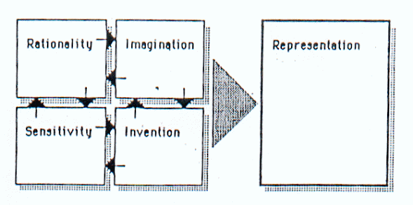
From the above Figure 1, design is in simple terms identified as a way of providing a solution to the existing problem. To design a certain art model that solves an existing problem, designers must follow certain semiotic features so that the end design model is acceptable to many viewers. In this case, the design must be appealing to the eye without compromise. There are various advantages of semiotic aspects in design. For example, in semiotics, semiotic features like uniformity in representation, the type of representation and the method used to add more value to design unlike in typography. Moreover, other semiotic features include the type of representation and the relationship between the design procedure and the ultimate artifact. If designers follow these processes well, all viewers will understand semiotics as a beneficial process in graphic designing.
External forces and factors like political, economic and cultural diversifications play a big role in graphic design. These factors act like opinion donators to graphic designers. Therefore, these graphic designers work towards a certain objective. The objective has to be result-oriented and represent appealing solutions. It is through applied semiotic means employed in design by designers, which make goals achievable. Design is cannot be intuitional but rather semiotic. Non-complicated areas like signage and typography do not require complex semiotic skills. They only require simple rudiments like impulsiveness, even distribution and inventiveness. The only problem with typography is that it lacks expressional perfectionism to the viewer. If this element is missing in a designed object, then the designer did not apply semiotic features in designing the object. The figure below forms a representation of designs made using semiotic theory.

Representation of Designs
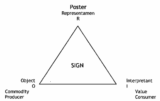
Semiotics is the science of knowledge whereby a designer applies semiotic skills in designing a model that will provide a solution to the existing problem. Signs constitute semiosis at different levels of design. Designers and graphic researchers classify these in three main classes namely: syntax, semantic and pragmatic. Syntax is an affiliation between signs and their constitution within a design. On the other hand, semantic is the message the signs convey to viewers or the relationship between signs and objects. The relationship between the object user and the sign is termed ad pragmatic. These three classes form semiotic theory. Through these classes, designers are able to design models based on likeness and representation. Figure 3 represents a model of semiotic terms. (Terence, 2003, pp.100-120)

Semiotic Terms
Sign contains operators like insertion, omission and substitution. These operators are design rules. Semiotics is a system that designers apply in graphic design to produce a result-oriented object. Additionally, designers use it in analyzing different modes of communication then supply a methodology under which the communication can be reverted to a representation.
Semiotic processes enable designers to make four poignant judgments as far as graphic design is concerned. Firstly, it helps designers to comprehend how they can efficiently use most advantageous communication modes in providing an interpretation. Secondly, semiotics helps designers in identifying a technological avenue of solving problems. Thirdly, the process is a source and a well of answers to identified problems. Lastly, semiotics means are good in analyzing and providing various dynamics of design without much strain. In typography and signage, designers do not apply semiotic processes. Therefore, the objects lack connotation, lucidity, integrity, and suitability. All of these factors exhibit in a semiotically designed object.
Conclusion
Semioticians apply several methods in designing a model. Through comparative analysis, designers derive graphic designs acceptable to many viewers. The process also involves structural characteristics otherwise functional characteristics that will determine the appearance of a certain design. The last process used is of course generative in that, new objects, models and design tests results. Nevertheless, design semiotics is the creation of new objects where signs and practical dimensions dictate. The goal of any design is a major pragmatic decider of the designed products.
What matters most, is the intended use of the object and the ability of a viewer to identify its representation and appropriateness. Hence, in semiotic designing, semiotics in graphic design is the use and dominance of signs for artistic work. The signs must be appropriate to their intended use and they must represent an object under interpretation. Semiotics introduces simplification procedures in graphic designs. The theory helps designers to categorize potential communication avenues and mutual working relations between designers. Most of the present-day designs have in one way or another benefited from semiotics. Computational and rudimentary models fall under these classes of designs that have benefited from semiotics.
References
Chandler, D., 2005. Semiotics for beginners. Web.
Design and semiotics. 2010. Web.
Douglas, M., 1982. The future of Semiotics. Semiotica, 38(3/4), pp.197-205.
Innis, Robert E., 1986. Semiotics: An Introductory Reader. London: Hutchinson.
Nadin, M., 1984. On the Meaning of the Visual. Semiotica, 38(3/4), pp. 335-377.
Ockerse, T., 2002. Semiotics: Principles in action for the Graphic Designer. Web.
Roland, B., 1977. Elements of Semiology. New York: Hill & Wang.
Terence, H., 2003. Structuralism and Semiotics. New York: Routledge.
Weller, J., 2009. Semiotics. Web.