Ancient Egyptian Design
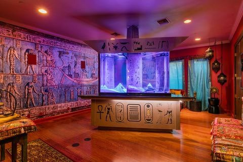
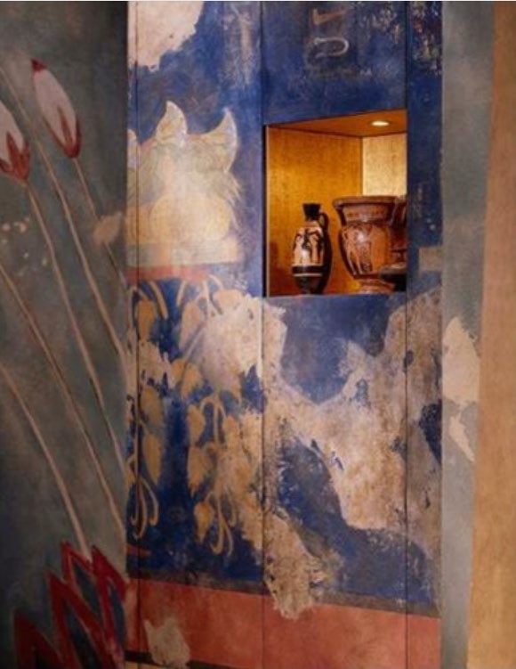
Pictures A and B perfectly represent the main attributes of the Ancient Egyptian- inspired interior. Picture A demonstrates the inclusion of Ancient Egyptian wall frescoes and decorations, as well as hieroglyphics, into a modern setting at Shaquille O’Neal’s Orlando mansion. Beige and brown tones are balanced by brightly colored curtains and the lighting of the aquarium room. As for Picture B, a wall niche displaying Ancient Egyptian vases is surrounded by vivid blue tones. The outlined elements in the two pictures create a unique combination of motifs that manifest the Ancient Egyptian design style. From my perspective, these features add a distinctive “ancient” look to the interior, revitalizing otherwise neutral color schemes.
Ancient Greek
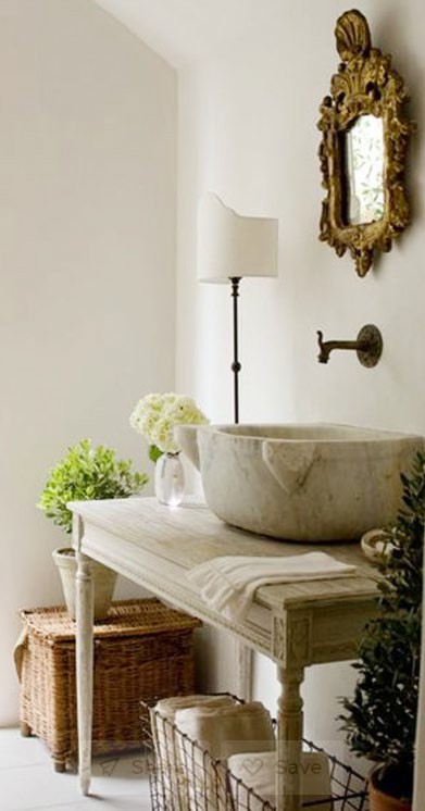
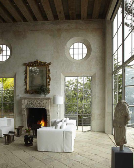
In picture B, the materials that characterize the Ancient Greek aesthetic become even more evident in this Malibu estate featured on Houzz.com. The Abundance of stone, white and Gray colors and sculptured surfaces highlight the simplicity of ancient Greece interiors. Another distinct quality is the mirror resembling copper design, a prominent feature of Greek homes and culture. The wooden surface, the prominence of light, and the surrounding green environment perfectly display the elements that were often present in ancient Greek homes. I think that these pictures present a perfect combination of modern advancements and ancient designs that create a more rural atmosphere, perfect for many contemporary buildings.
Ancient Roman
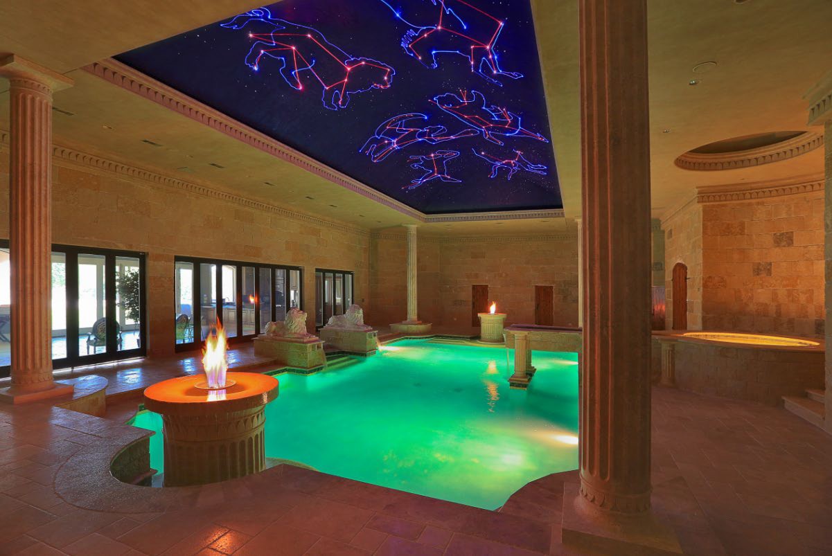
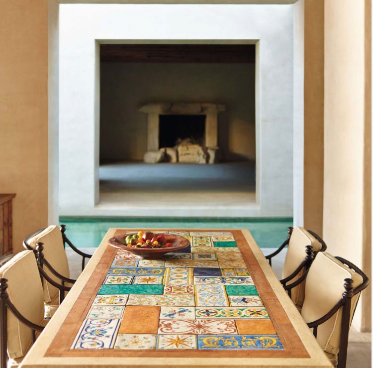
Picture B demonstrates how Roman elements can be included in a contemporary setting through the use of a mosaic ornament on the table. The inclusion of neutral, yellow, and beige colors perfectly coincides with the characteristics of an ancient Roman interior design. I believe that this style can be an excellent addition to modern homes, especially the mosaic effect, which revitalizes the neutral colors and brings the artistic element into the environment.
Ancient Chinese
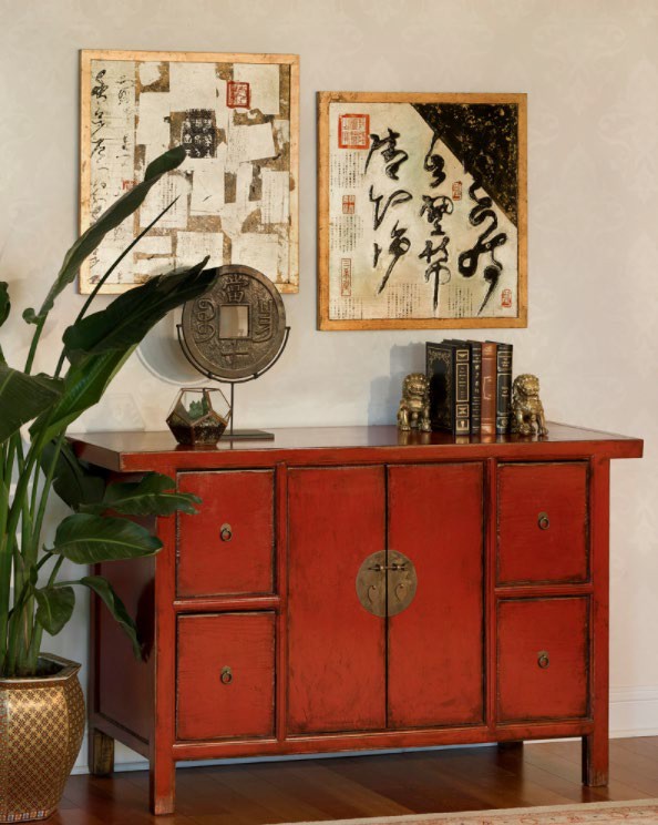
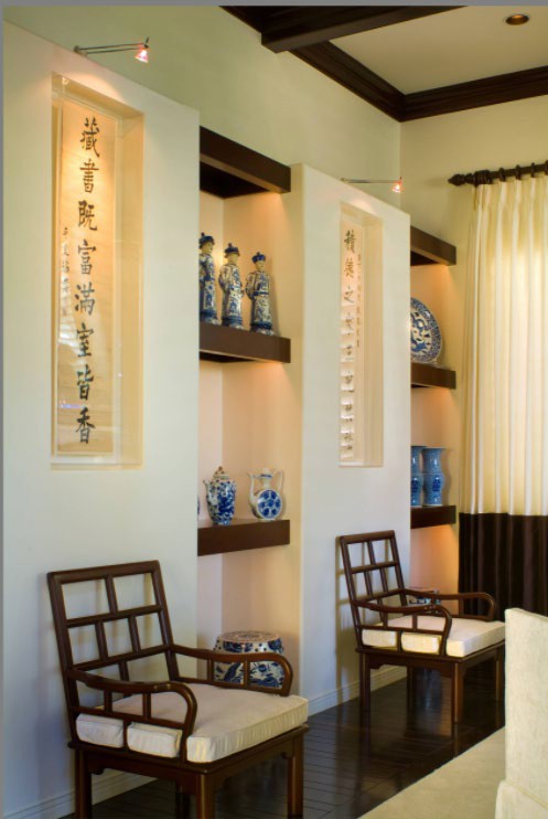
The incorporation of white colors was also prominent among ancient Chinese residents. Very often, bright creme and beige colors were contrasted with dark wood increments that revitalized the atmosphere. This characteristic is highly prominent in picture B, which portrays the interior environment inspired by ancient China. Moreover, the inclusion of Chinese figurines in white and blue underlines the native Chinese style, perfectly capturing the main attributes of there is interior design. From my perspective, this style is rather distinct from other manifest instances and becomes even more interesting due to the contrast of bright and dark colors.
Gothic Design
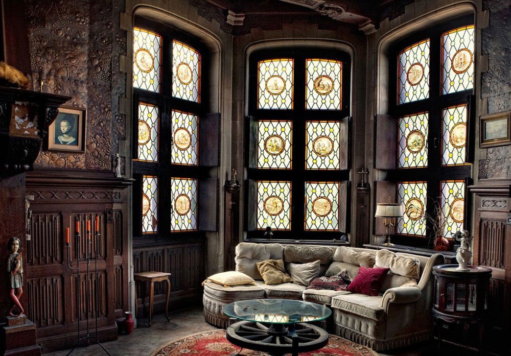
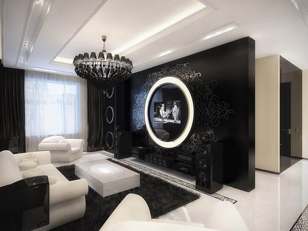
In my opinion the Gothic Style is unique and functional. The color scheme is something I love about it. On the modern side it is very clean and crisp with added ornaments for an extra “wow” factor to finalize the space.
Renaissance Design in Italy
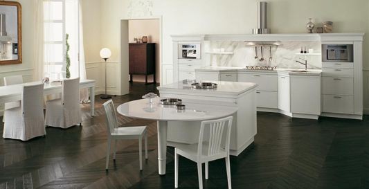
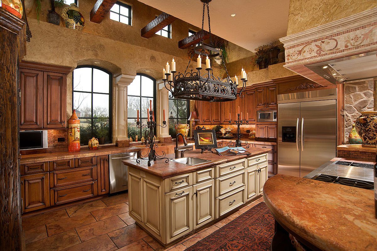
The Italian Renaissance superseded the Gothic style. Within all classes art became more poplar, with building design being the main focus. The interiors of the buildings and or residence consisted of contrasting light and shadows, arches, ornaments, etc. Geometric patterns and symmetry were also a big part of designing interiors and exteriors during this time. Most of the rooms were rectangular, as well. The furnishings have a restrained character and a strong architectural sense. They used mainly wood for cabinets, tables, and chairs: they were mainly carved with unique designs in them as well. As shown in FIG 1 the style of this kitchen is still classical with a modern twist. Using flat panels for the cabinets, functionality for the island and the color scheme is what gave it a clean modern look. The small accent touches is what gave a it a more classical look like the golds, herring bone flooring, chair covers on the dining table to the left. It all ties together well.
Renaissance Design in France
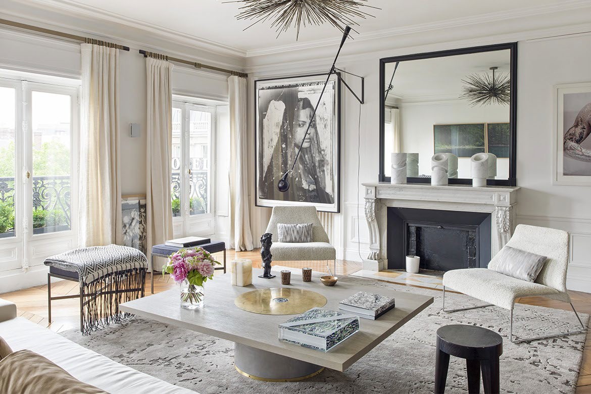
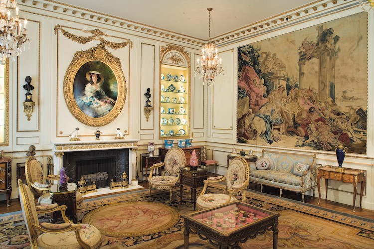
If you haven’t started noticing everything started with the Gothic Design. Each subject has taken bits and pieces of the Gothic Era. As the renaissance got deeper the design became more symmetrical and regularity. France was known for larger rooms and decorative schemes became fitting for that certain room. French exteriors did not match the interiors: the exterior was more medieval whereas the interior was classical with gothic samples. The interior was designed with plaster walls, tapestries, hanging cordovan and large windows. Furniture was functional and comfortable for the home. Stools and benches were still widely used in this era as well. This was a time for people wanting a “royal taste” in the design of their residence. Still honoring the past, designers today will use black and white schemes but then use patterning for the accents to add French Interior and still keep it modern. You can find the pattern in flooring, pillows, rugs, and different pieces of furniture.
English Renaissance
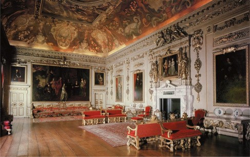
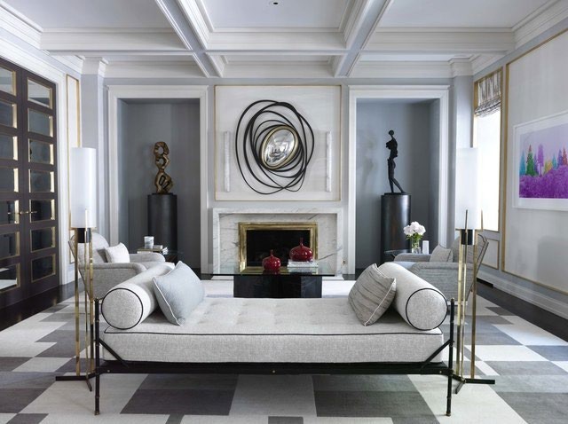
Renaissance Design in England became lighter and brighter but still using the Gothic samples. In Italy and France, it was more about wealth and power; here in England they are more conservative and independent. Meaning that the design of the interior was not as stylish. They didn’t have any access to classical forms, so they leaned towards the Medieval traditions. In the interiors they used tiling which was good around a fireplace, so it was practically fireproof. The ceiling beams are often revealed to give it that Medieval look and they used Dutch tiles for added support from water damage on the floors.
This modern interior still keeps the renaissance feel. The tiling of the fireplace, sculptures in the walls. Patterns on the floor. They kept the scheme white and bright but highlighted different points to keep it within “history”. The paneling in the ceiling and molding around the it as well. Just like in FIG 1.
French Baroque
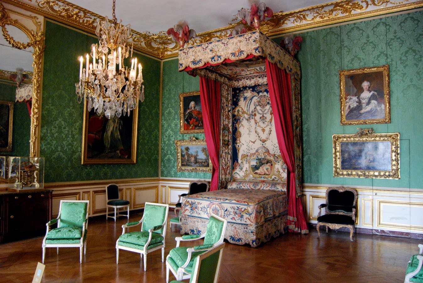
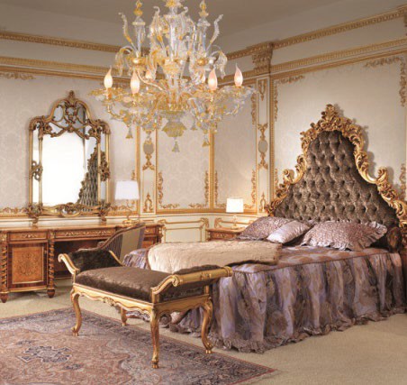
In picture B, gilded floral ornaments of the walls and furniture remain the direct transfer of the French Baroque to Modern Style. The furniture, such as the cabinets, bedside bench, and chairs, retained their heavy rectangular forms in a symphony of gold and black colors. The floor is often made from oak parkette and black and white marble. Instead, plain creamy flooring with a single carpet is used. The rug is used to complement the color and the design of the bed, which also received a renewed image with a more minimalistic design as it lacks the drapery curtains. As the result, the renewed look of the Picture B seems to be lacking as the royal bedroom in its definition. Minimalistic design is alluring with its practicality but in terms of theatrical aesthetic value of classic Baroque it seems to be inferior. Moreover, the portraits on the walls and candled chandelier of Picture A add charming and fairy feel to the interior.
William and Mary
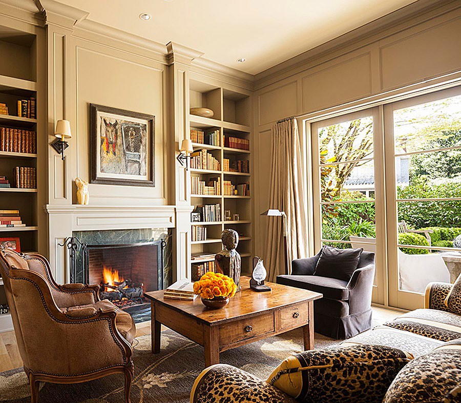
William and Mary encompass the first steps towards modern minimalism. The primary material for the furniture was oak with a simple attenuated design and a variation of red color. The color themes were stricter, darker, and warmer in comparison to Rococo. The design is heavy-looking and abundant in the usage of straight lines despite the presence of curves. It was heavily impacted by utilizing opulent veneered surfaces, which gave the wooden pieces their royal style and sturdiness (McKenzie). Nevertheless, comfort and functionality were the turning point of the design. A smaller application space made it an excellent material for the popularized American home styles shown in picture B. The picture B demonstrates the deviation from the classic with the renewed image of the curves and lines. The furniture received a refresh on these aspects as the armchair on the left of Picture B received a curvy wooden outline. The coffee table has some compartments that remind of the cabinet used in Picture A. and sturdy straight rectangular legs to adhere to the minimalism of the past. The walls demonstrate less color and more straight lines that act as the texturing element to the decor. However, warm colors remained, but instead of the contrasting elements of the past, the modern style became a thriving environment for the unity of color composition. Even though restyled William and Mary interior lack its previous 19th century royal manor, it has greater symbiosis of the furniture and the room and displays lucrative approach of the future. However, the tawny black spotted sofa might be an uncomfortable or superfluous addition to the design.
Queen Anna
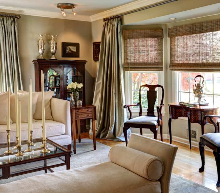
This design was “greenish, divided by dado and picture rails, full of spindly ebonized furniture, blue and white china and peacock feathers” (Edwards and Hart 18). Picture A is the representation of these features, except for the absence of peacock feathers. The furniture looks charred, with the legs of the chairs mirroring the curves in the William and Mary style. At the same time, the greenish color saturates the comfortable environment for the dark and contrasting chairs. There are no ornaments that may point to the Rococo or Baroque designs. As a result, it lacks the luxury and strictness it encompassed. Light wooden flooring has rush matting that interplays in creating a comfortable environment with the sofas and walls. The chairs which try to follow human anatomy with their curves on the arms and legs are also common attributes of the style.
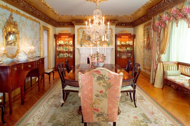
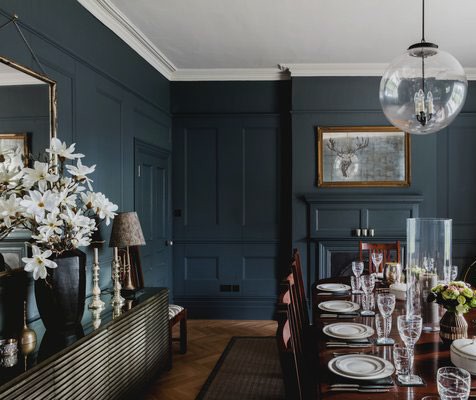
The vision on Picture B plays with cold and dark colors, which form a strict and business-like attitude of modernity. Ebonized chairs and a dining table remained as the central piece in modern style, which resembles Queen Anne design, with a rush matting of dark-brown color that can be seen as the respect towards the vision of the past. A distinct feature of the Picture B is the chandelier which seems to be a tribute to the futuristic visionaries of the 80s. The patterning continues the simplification seen in William and Mary style as basic lines start to prevail due to the cabinet on the left of the picture. The modern design seems to be more attractive due to the aura of coolness and calm in exhibits. The white flowers in black vase define this calmness into the image of peace akin to that of yin and yang while blue walls act as a reference to refreshing waterfall.
French Neoclassical
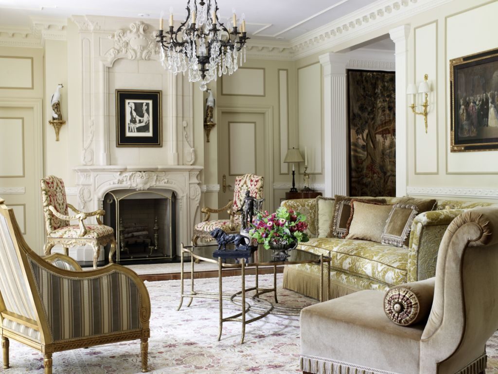
Picture A is a demonstration of a standard French neoclassical interior design, and the main objective of such a design method is an enhancement of the overall sophistication and elegance presented in space. The main difference of the French neoclassical design is a more reserved modesty and muteness in comparison with previous eras, but it still is able to achieve an astonishing degree of elegance in a subtler way. The selected colors tend to be mild and soft, such as green, yellow, blue, gray, or cream, and highly contrasting colors or eye-catching ones are only and primarily utilized in order to accentuate specific elements of an interior. The furniture evidently and partially blends with the background coloration, but mild green patterns provide a visual distinction from other elements.
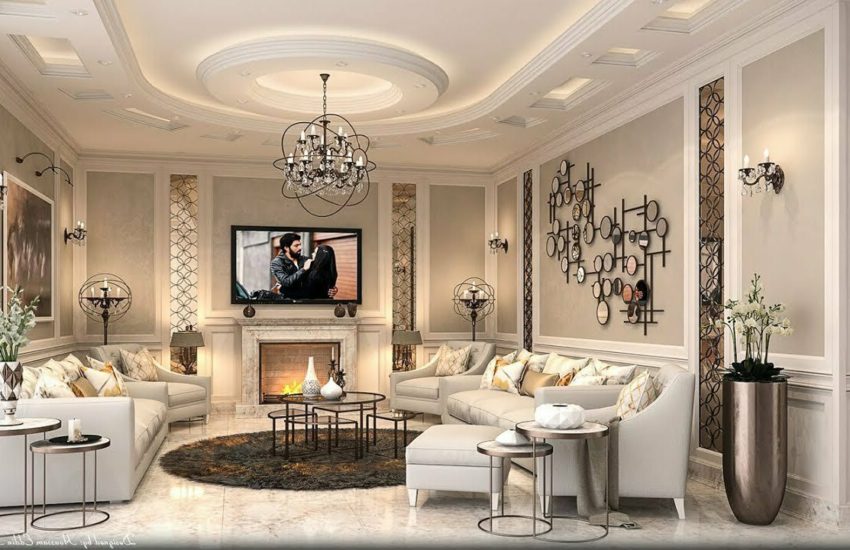
Picture B is an outstanding illustration of how French neoclassical interior design is integrated into a modern setting. Firstly, the color mildness and the lack of contrast are preserved with even more subtle ceilings and carvings. Modern technology is utilized and put in place in accordance with the overall theme, such as TV. The furniture color still partly blends with the background but is slightly distinct due to patterns on pillows. Light sources are incorporated on both the ceiling and the walls without evident protrusion and invasion of the general space, which makes the entire room sophisticated without appearing flashy, and thus, the viewer’s attention is not drawn to side elements but rather the center. Such an approach also enables more prominence of essential structures without a need to make them extravagant.
French Empire
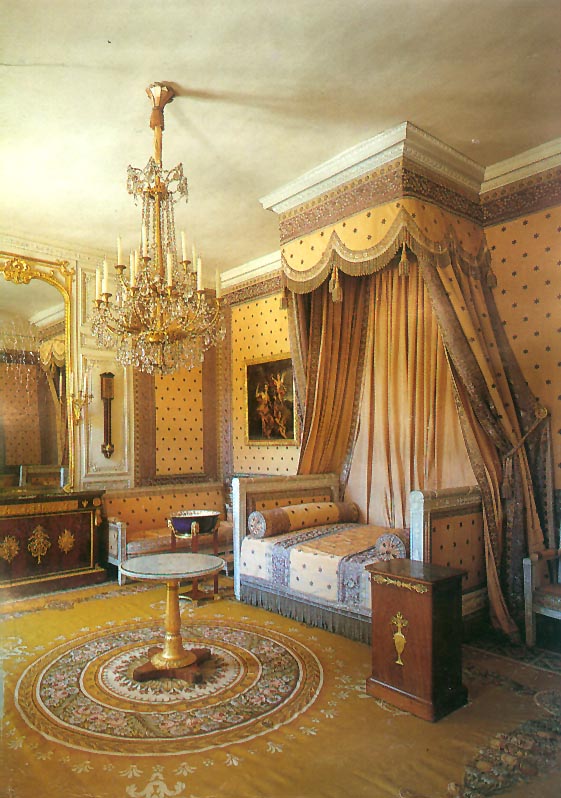
Picture A is demonstrative of essential elements and features of French Empire interior design, which was inspired and initiated by the first emperor of France, Napoleon Bonaparte. Unlike the previously mentioned style as well as interiors of preceding eras, the given method of design brings back the sense of richness and luxuriousness. French Empire design is highly inspired and influenced by the classical framework, where the key emphasis is put on impressing viewers. The fundamental characteristics involve bold and contrasting color combinations as well as gilded ornaments used excessively. Large chandeliers are used to enhance the decorative aspect of a space. The lining and coloration of furniture are also bold, which draws attention to solid and clearly visible details.
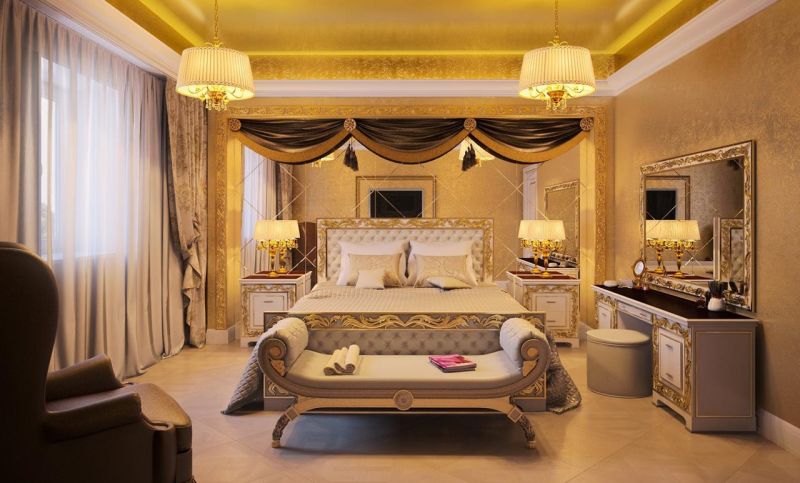
Picture B showcases a bedroom interior design done on a core framework of French Empire style with minor modernist elements. The use of golden or yellow colors is present, which is actively accompanied by gilded ornaments and light sources. Both the ceiling and the floor use different shades of yellow to impress a viewer and convey a message of richness and excess. However, in order to preserve some modern features, patterns of the floor and the walls are less distinct or even absent in order to create an illusion of smoothness and monotonous surfaces. In addition, the shapes of integral elements are sharply perpendicular to each other in order to preserve some form of modern aesthetics and looks. Oval windows can be draped with a fabric to match the walls so that a lambrequin of complex shape repeats the pattern on the fabric. Wall lamps with frosted shades are decorated with carved wood details, carved with the same motif, doors have glass and bronze insertions.
Georgian
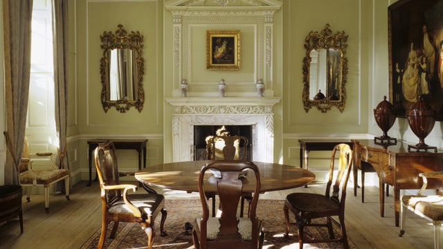
It is important to note the fact that the Georgian interior design was initially started during the consecutive rule of four King Georges, where the central elements revolve around lightness of touch and elegance. The given framework is inspired by a combination of different styles, such as Greek patterns, Roman alcoves and niches, Doric or Corinthian columns, as well as classical figures. Picture A showcases some of these features, such as a subtler use of green coloration with ornamentation being done in a similar fashion. The wall elements, such as mirrors, have a luxurious design, but the background preserves the room’s lightness. The furniture is simple but elegant, which highlights the essence of the Georgian interior design.
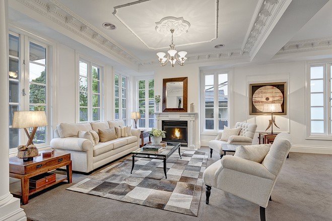
Picture B is an outstanding illustration of a more modernized version of the Georgian interior design, where more perpendicular shapes and lighter colors are used. The room is bright and elegant, but it still contains distinctive ornaments, with furniture being in tune with the room’s overall theme. Instead of hanging mirrors, the room uses windows, which are also clearly outlined, but the colors blend with the color of the wall. As with the previous picture, the accentuation is made towards the center of the room, where the table is located. In other words, the use of modern figures replaces the classical elements of the Georgian style, but the elegant and light features are preserved. Modern welcomes various and geometrically complex shapes and decor of windows, doors, stairs. Carved frames of windows and doorways made of natural wood have a curved shape. They, like branches of fancy vines, cut window glass or doors into complex components.