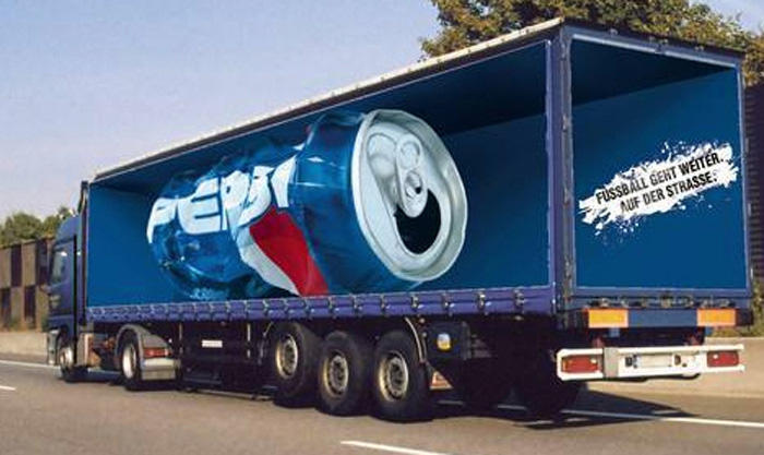
The following is an analysis of the Pepsi ad that captures the attention of the on-lookers as in the figure shown. The research question will therefore be; what would be the impact of displaying a forged Pepsi bottle in an amazing blue color background? It follows that thesis statement will be; a forged Pepsi metallic can will improve the appearance of the poster. This poster portrays utility satisfaction from taking the drink. It is from this idea that I am drawing my research in coming up with the best ad to give to this drink.

A great post gives audience a sense of anxiety. It is from this anxiety that many will proceed to trying out the product. An appealing poster should have a universally accepted icons and message that will find place in the hearts and minds of the target consumers. The poster used in creating an advert should be highly raised, well illuminated and readily visible for improving vicinity across a wide area. All the writings used should be eligible. The on-lookers should not experience difficulties in trying to capture the message contained in the poster because in such a case, most will not even struggle to understand but will only pass.
Analysis of the Photo
A photo of a truck transporting Pepsi alongside a mind capturing statement is the poster to sell this brand. In this regard, the statement portrays quality of the drink and satisfaction in the units of utility attained after its consumption. The poster is influential in a positive way to the general society by having a universally accepted values and icons. It is estimated that a good poster should attract at least 80% of the on-looker. Out of the 80% on-lookers, it is also estimated that about 65% will end up trying the product.
Pepsi Poster Ad Development and Analysis
The photo on the poster incorporates the appeals to the logos, pathos and its ethos. The notion of refreshment can be deduced on the poster as evidenced from the bottles state. Its forged form shows a creative and imaginative aspect attracting the attention for many onlookers. The poster presentation is appealing from the background colors applied in creating it, therefore, the ad creates memory to any person looking at it; a quality that a good should advert should have.
The bottle in the ad remains in a steady intact condition retaining all the important features of a bottle. This is an important feature since it assures potential customers of a reliable product that can stand external forces and still maintain its quality characteristics. In the poster are transparent truck walls. This notation conveys transparency in the process applied in manufacturing Pepsi and the transport mechanisms. It can be deduced from this aspect that the drink is valid and safe to drink.
Safety to the user is a paramount consideration in creating a selling brand. From the selling statement of the post, some form of goodness is seen emanating from abruptly opened can. The blending of this feature and the matching of colors in the display is culturally relevant. This is a universally accepted notation, acceptable to diverse cultures across the world. The Pepsi post creates a mixture of emotions among the onlookers capturing the sense of heritage.
The poster is designed in a rather cognitive appearance that will ensure that onlookers will spend some time in trying to analyze its contents. This way, the message sticks in their minds, making the brand memorable. The poster also conveys a quality product based on its realness in the design. As such, it is anticipated that the ad will address anxieties caused in the quest of deep desires to unravel the meaning contained in its contents.
Blue, red and white colors used in the poster are visible from far. In spite of being attractive, the colors are considered as a symbol of beauty. This analogy blends well with most societies and regions, giving the ad acceptability to most societies. From the same, it can be deduced that the product is clean. White color symbolizes cleanliness, with which Pepsi will be considered to be clean for consumption among many consumers.
The design of the post has trickling meaning that is self-sufficient. It appears consistent with the desires of many drinks to quench thirst. This can be deduced from the warm conditions surrounding the poster, hence, it can be seen to be a possible solution. Such an analogy helps to create a mind perception that the drink is a timely and readily available response in dare needs. It is the expectation of every product manufacturer to compete favorably with other competitors in acquiring consumers as potential customers.
However, this expectation is not met by most companies because of poor advertisement techniques applied. The truck used in the poster is seen to be fast moving. This aspect displays responsiveness of the Pepsi manufacturing company to the customers’ needs. In this way, the advertisement of the Pepsi will be iconic to attract consumers and enhance the purchase of the product.