Posters act as one of the many means of communication. To draw attention of the target audience, posters developers have to make sure that they design their posters in an attractive manner. Moreover, information conveyed by posters ought to be brief and precise, as audience never takes time to go through clogged posters. Good posters reduce the chances of the target audience spending most of their time critiquing the message.
Different people use varied designs when developing their posters based on the target audience and information they intend to put across. Moreover, an individual learns a lot about communication when developing a poster. This paper aims at commenting on lessons learnt about communication when developing three posters. Besides, the paper will comment on the strategies used in developing the three posters, reasons why I used certain design for specific posters, and improvements that can be made on the posters.
Poster 1
I learnt a lot about communication when developing this poster. First, I realised that placing the title or theme of the poster at a strategic point goes a long way to draw the attention of the target audience. Audiences do not have time to go through the entire poster to identify the theme or unravel what the poster intends to put across. Hence, to communicate effectively, it is imperative to place the theme of the poster at a place that all the target audiences will identify easily.
Apart from learning about the importance of placing the poster’s theme at a strategic position for effective communication, I also learnt that the order in which information is organised in a particular poster plays a crucial role in ensuring that the audiences understand the message. A jumbled poster turns off the desire by audiences to understand the poster’s message. One should organise his or her poster in a way that audiences can read it at the first glimpse. I learnt that it is imperative to use an appropriate font and font size to ensure that readers do not strain when reading a poster.
When designing the poster, I used a number of strategies. To start with, I identified my target audience. Identification of target audience is vital since it helps one organise his or her information in a manner that the audience will understand. After identifying the target audience, I went on to identify what I wanted the audience to do after going through the poster. This aspect helped me identify the kind of words to use in the poster. Identifying what one wants the audience to do after going through the poster helps in making sure that he or she uses the right words in his or her message, thus luring the audience to abide by what the poster says.
Upon identifying what I would like my target audience to do, I proceeded to breaking my information into blocks. By breaking information into blocks, I ensured that I could convey all the intended information comfortably. Besides, I ensured that I came up with the right size of the poster. The breakdown also helped me ensure that I placed my information in sequential manner thus helping the target audience to understand the information easily.
One of the main reasons why I decided to use this design in my poster was to ensure that I captured all the information I intended to put across in a single poster. The poster conveys a lot of information and thus putting all the information in a single block would have made it appear cluttered. Hence, I had to split the information and put it in different sections for easy reading and understanding.
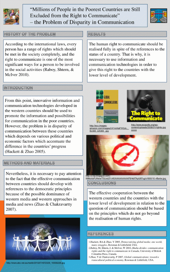
I decided not to include many pictures since they would have compelled me to drop some of the vital information. I decided to use the black colour to make sure that my target audience is capable of reading the poster. Since the poster includes a lot of information, I avoided using many colours to avoid it looking cluttered. Using numerous colours in the poster would have made it appear too littered thus discourage people from going through it.
After reviewing the poster, I realised I could make numerous improvements on the poster and in the designing process. For instance, in the design process, I could come up with a sound changeover from one block of information to another. About the poster, some of the current photos are hard to decipher; hence, one of the changes I could make in the poster would be removing these photos and replacing them with others that are easily understandable.
Poster 2
When designing this poster, I learnt that pictures speak louder than words. I realised that most of the target audiences do not take time to read all that is written in posters. Including appropriate pictures facilitates in conveying message to the target audience. Communication does not entail including a lot of information within a poster. Instead, it entails the order in which the poster is organised. The language used in the posters really matters.
For instance, when passing across information about communication as one of the human rights, I learnt that I could only manage to put across my message if I presented my theme in a neutral manner. In other words, I learnt that the theme of any poster has to be captured in a way that it attracts all the target audience. Coming up with a discriminative theme may discourage even the intended target audience, which hinders successful communication. The colour used in developing a poster helps in communication. Too dull posters do not attract audience. On the other hand, audiences do not like posters that contain so many colours since they appear too cluttered.
When designing the poster, I started by identifying the information I intended to put a cross. One cannot develop a poster if he or she does not have a picture of what s/he intends to put across. Besides, identifying the message helps in coming up with the poster layout. After identifying the information, I split it into blocks and embarked on developing coherent switches from one block to another. The main reason for coming up with these coherent switches was to ensure that the audience has a clear picture of what the poster intends to convey. I then proceeded to look for appropriate photos to include in my poster.
I ensured that I did not include too dark or complex photos since it would be hard for some people to understand the meaning of the poster. In coming up with the final poster, I ensured that the most important things were captured first. Capturing the most important things first implied that even if a person did not go through the entire poster, he or she at least would get the message. To make the poster attractive, I used a grid to align the different blocks of information. This helped in making the layout appear attractive thus making it possible for target audience to go through the entire poster and connect the varied blocks of information for easy understanding.
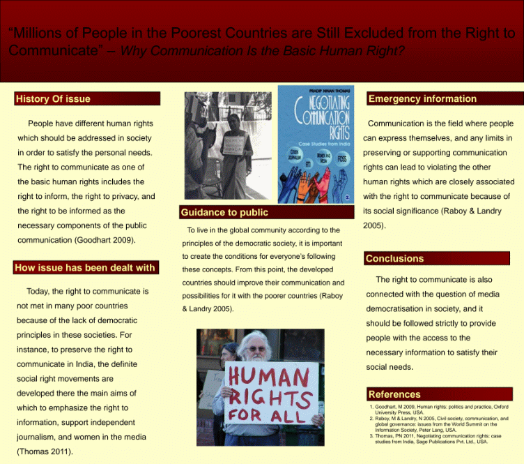
The main reason I opted to use different colours in my poster is to make it attractive. Using a single colour would have made the poster look dull and thus not appealing to the target audience. I placed the photo of the man holding a placard advocating for human rights at the centre to make the audience understand the theme of the poster. I chose this photo because it is clear and easy to understand. Information contained in the placard is catching.
Hence, upon reading this information, an individual is tempted to go closer to the poster to understand the information it carries. I opted to split the information and organise it under different subheadings to make it simple to read and understand. If the information were compressed under a single block, it would have been hard for audiences to go through it and understand. Using different subheadings makes the poster attractive and even simpler to understand as the subheadings indicate the message contained in the blocks.
After reviewing the poster, I realise that I can make numerous changes in the poster as well as the designing procedure. For instance, the font size used in this poster is not so good. The font size is too small for most of the people to read. Hence, to ensure that people read the poster without straining, I can change the font size and make it bigger. In addition, the theme or title of the poster appears too big. I could change it to be shorter and captivating.
The colour I used at the top of the poster makes it hard for people to read the title. I could also change that colour to ensure that the title is readable. In designing the poster, I could come up with an appropriate text hierarchy. By using text hierarchy, my target audience would be in a position to identify the array of significance of the message conveyed by the poster. This aspect could facilitate in ensuring that people understand the message communicated through the poster.
Poster 3
When developing this poster, I realised that communication does not entail the number of words one includes in his or her poster or the number of colours used. Rather, communication entails how one presents his or her ideas in a poster and how the different blocks of information are organised and linked. A person may write a long prose and fail to put across the intended message because of not using the appropriate words.
Besides, I learnt that photos used in any poster help in communication. A poster without visual aids looks dull. On the other hand, a poster with visual aids appears attractive and is easy to understand. Besides being attractive, such a poster is capable of passing information to the target audience without one having to go through the text included in the poster. Hence, I learnt that including appropriate photos in any poster adds to the capacity of the poster reaching the target audience.
The order of information in any poster goes a long way in enhancing communication. As I was developing the poster, I realised that it is hard for people to understand the information contained in a poster if the information is not organised in the order of importance. Hence, it is important to have a certain hierarchy when developing a poster.
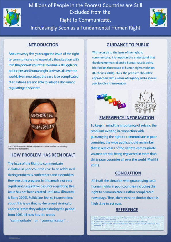
Before coming up with the poster, I had to make sure that the final poster carried all the intended information. I started by identifying the information I intended to convey and split it into blocks. I then arranged the different blocks in the order of their significance. In addition, I weighed various formats and settled on the column format, which I felt that it would accommodate all the intended information and make the poster appear uncluttered, to ensure that the poster looked attractive. I developed a sketch of the poster and used it to organise all the information I intended to convey through the poster.
The sketch helped me link the various blocks and come up with a coherent transition from one block to another. To make sure that the poster conveyed the information accurately, I decided to reinforce the text message with photos. Hence, I proceeded to look for the best photos to include in the poster. I ensured that the photos were in line with the poster’s title or theme. I tested various background colours to ensure that the text in the poster was readable.
Ultimately, I decided to use blue and white colours in writing the title of the poster as the two colours made the title clear and easy to read. Failure to have clear and easily readable title amounts to failure of the entire poster. I decided to use the same font throughout the poster to avoid confusion by the audience. Using numerous fonts in a single poster makes it hard for the audience to understand the order of significance of the information contained in the poster.
By using the same font with different font sizes, I intended to ensure that people understand the flow of information in the poster. Many people read articles from the upper left corner. Hence, using the column format helped me organise the message in the poster in the order of significance from the upper left corner downwards. I opted to use a gray background and blue colour in my text since the combination makes the text visible. Invisible text discourages people from reading the posters since it takes them a lot of time. Besides, the audience strain when reading the contents of a poster.
After reviewing the poster, I felt that I still needed to make some changes in the design process to make it more attractive and understandable. Instead of using a uniform font, I could come up with three fonts, one for the title, one for the subtitles, and one for the text. The different fonts would make the reader figure out the order of significance in the conveyed message. The photos included in the poster are hard to understand and cannot convey the entire message.
Hence, one of the changes I would make in the poster is replacing the current photos with other photos that are easily understandable. Including easily understandable photos in my poster would facilitate in reinforcing the text. Besides, the photos would help in drawing the audience’s attention. The title of the poster is too long, but it should be short and precise; therefore, I would also reduce the length of the title and make it more precise.