Introduction
Web accessibility is the term used to refer to the usability and accessibility of the website by the differently-able or disabled people with auditory, physical, cognitive, visual, cognitive, and neurological disabilities. In other words, an accessible web makes the different types of disabled people understand, perceive, navigate and interact on the web. Different disabilities affect the usability of the web differently and form the scenarios to be adopted in web development.
As the number of people using the web for education, employment and education purposes, the ratio of people with disability that are using the web also increase, reflecting the need to increase the web to their access. Web access to disabled people reduces the digital divide and is a socially responsible issue. So, the current paper intends to identify how web accessibility is observed and created for Colorblind people.
Problem Statement
How website design is made accessible to the color blind and the different types of color blindness with the click of a button
When the web is more accessible to the major audience, the purpose of the web enablement will be fulfilled. However, color blindness prevails in 12% of men. And it is also known that 8% of American men (one in twelve) have some form of color blindness. What if the hot customer who has color blindness is not able to submit the order form when he could not understand the instruction stating the green button for submission and a red button for cancellation? Such circumstances made the web developers think about the web accessibility issue for color blind people.
Body Context
Color Blindness
Color blindness, though treated as a disability, little is known about its awareness and the facilities to reduce the troubles associated with it. Though there is no clear figure on how many people suffer from the problem, the disability definitely disturbs online activity. The official statistics say that more than 8% of males and between 0.4% – 2% of females in the US are color blind. The disability is in several forms and is commonly termed as color blindness or color deficiency. The disability causes color vision confusion and is known as CVC in short.
Color blindness is a problem in seeing colors as most others see them. But it is not blindness; it has nothing to do with the eyesight. These people confuse some colors and may not see someones at all. Many people think color-blind users only see black and white – like watching a black and white movie or television. But only a few people really do not see all colors.
At the back of our eyes, there are cones (blue, red, and green) that pick up color and rods that pick up the brightness. Colorblind people have fewer cones than normal, so they get color confusion. People see differently with different colors. The most identified color confusion is between green and red.
There is no known factor that causes color blindness; there are assumptions that factors like head trauma or treatment. Industrial pollution or sun and may cause color blindness. When people get old, their corneas turn yellowish, damaging their ability to see violet and blue colors. There are various forms of color blindness.
Usually, Color vision is recognized with the following forms. And any alternative can cause disturbance in them. The people who have full-color vision are called Trichromats. Dichromats can only see two of three primary colors of light, i.e., red, green, blue. Diplomacy is again several forms—the people with Achromatopsia experience all the colors as monochromous or greys. Achromatopsia may be called actual color blindness.
The colors visible to the normal vision people are as shown in Figure 1.

The same colors are shown in Figure 1 appear as the colors shown in Figure-2 to the people Who have an absence of red sensitivity and red weakness.

And to the people with green sensitivity and green weakness perceive the Figure 1 colors as like the colors shown in Figure 3.

The people with absence of green sensitivity and green weakness perceive the same colors as the colors shown in Figure 4.

The above illustration gives clarity on why web designing for accessibility should differ greatly to include the adaptability for all types of above people. Many web pages that are designed for general users run with combinations of foreground and background colors that virtually make the pages unreadable for color-blind users.
When a website is less accessible and confusing, it loses its visitors. But when the website becomes more accessible, it not only brings recurring visitors but also brings new visitors through word of mouth from all those who access the site. Also, the website that attains accessibility guidelines will also be the one that gains search engine. This reduces the cost of search engine optimization work if done additionally. Also, the website which is accessible becomes user friendly and improves the usability of the site through the well-structured placement of content, layout, colors, and ease of navigation, etc.
The highest obstacle in making the web accessible to color-blind users is nothing but color. So when the purpose is to make the site more accessible to color-blind users, it is the wise utilization of color and not relying on color alone to communicate with the user. As the general website design and development goes according to the needs and tastes of the general population, they will be high with colored visual entities and may discourage the usage of the same by the color-blind users.
In targeting the web accessibility issues, it is important to consider the needs of individuals with disabilities during the web application development phase. There are certain guidelines to consider during the web page design process in order to provide more accessibility and higher quality web pages, especially for color-blind users. Most of these guidelines can be used while designing other documents to improve their accessibility to color-blind users.
Due to this imbalance in a color pick that is suitable for both the colorblind and noncolor blind visitor, there is a need for normalization of color choice and usage. Following are some of the guidelines on the above concern.
Avoid making the color the single visual cue: A color-based distinction of the website may not provide information equally to all the visitors. The sole color-based instructions for navigation may not be visible to color-blind people. So the website should ensure accessibility with examples of context. Eg: Instead of directing the visitors to select the options listed in green, the website can offer text like “Please select the green and circled items. Also, highlighting the issues with other style effects through font style and size differences can help in bringing up the difference. If confusing colors like blue, red, or green are used as font colors on the whole page, introduce another cue with the attributes like – underline or bold.
Instead of going with a single color for the entire page, introduce contrast colors on the web pages and on the other presentation materials.
Instead of using the navigation buttons with colors solely, give additional information with textual or graphic. Labeling the graphical elements will also eliminate dependency on color keys.
Since the text is more accessible to color-blind users than a colored icon, all iconic features should be accompanied by textual directions. Eg: Giving Alt support or highlighting the text or underlining will make the navigation easy for them. Also, enabling the images with MouseOver textual information and status line image descriptions will also help the color-blind users.
When the website is made up of black and white colors, the color-blind users will not be objected by the readability of the navigation directions for information on site.
During the instance of the necessity of color usage, it would be better to prefer yellow, blue, white, and black. The combination of such color combination will be less confusing to the color-blind users.
The page design should make a demarcation between the really useful information and the design entities to use the color in different proportions.
A flexible user interface to customize the font styles, sizes, foreground and background colors will be an added advantage to the color blind web users.
Avoiding the usage of font colors unless and until it is explicitly necessary will reduce the trouble to the color blind visualizations. Designers should practice avoiding the usage of color in everything. Also, while specifying the colors in the coding, if the developers use the hexadecimal codes (such as “#bb0000) instead of names like green, blue, etc.
Also, most computer users view in 256 colors or less, so the developer should consider this limitation in applying the colors irrespective of his choice and expertise.
So to even ensure cross-platform consistency in color scheme, it is recommended to design web pages with the 216 common browser-safe colors, known as dither-free colors, Web-safe palette, and 6x6x6 colors.
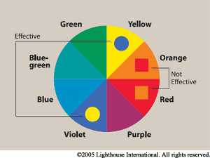
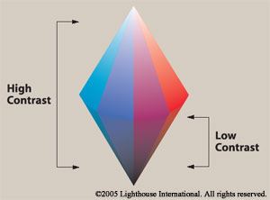
There are color combinations to be used on the web, which can be classified as not effective and effective colors. So sufficient contrast makes the text readable. When there is a great demarcation between the contests, even a fully color blind person can also make out the difference for instruction. Also, the usage of hues should be avoided between violet and yellow and also when the colors do not contrast sharply in lightness.
It is also helpful to avoid using the combination between red-green – brown – grey – purple, and red-green – brown – grey – purple.
If the color combination is necessary to be used adjacent to each other, then darkening of one and lightening of the other would also make the differentiation and helps the color blind people getting the information besides making the other feel pleasing with the colors.
Designers who practice proper color selection would select colors with greater contrast to make the information more pleasing to the eye. If for some reason, this sort of color combination is necessary, another approach may be darkening one color and lightening the other, which is a way of increasing contrast.
The colors used for BGCOLOR, TEXT, LINK, VLINK, ALINK, though they offer a readable mix, should go well along with the image loading. So usage of BGCOLOR should be limited to certain purposes only to avoid unreadability for color-blind users.
Along with the graphical representation with color, the text should be included in between to make it more user-friendly to the color-blind users.
However, If a developer has color blindness and is making a website of his own choice of colors, there may be very few chances of winning the appreciation of noncolor blind visitors with the site colors. The site may experience great variation with the color contrast.
Another tool that is helping the web application to be accessible to Colorblind people is Colorblind Web Page Filter to helps all kinds of color blindness. This allows the color blinder to customize its own setting by choosing the appropriate color filter after the URL. The following is the view of the filters and setting pallet.
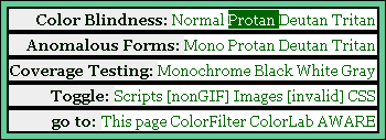
The above box offers all the different color filters and allows the user to switch the view by choosing the new filter. This box also contains the settings concerning scripts, images, and CSS to be adjusted by the viewer. Though the complete turn-off of the images will reduce the total trouble, it is not always possible as Images and colors carry Information. Eg: Green apple or Red apple. So in such instances, such filtering tools can offer a great advantage.
If the website is not built according to the accessibility guidelines, the cost of losing the visitors and the cost of remaking may result in more expensive. Building the site right the first time will reduce the maintenance costs and increase the potential market, and also makes the website comply with the government norms and accessibility regulations.
However, some existing sites need to be audited to find the accessibility gaps and then to improve the accessibility for the color blind. This way, the cost of designing the site according to the accessibility rules will be reduced.
View of the web pages on a monochrome monitor and on the browser with turned-off colors. It is also setting up a color scheme in the browser that only uses four browser-safe greys, black and white, to see how the page holds up. A printer can also be useful to test the readability of the text with background colors and grayscale options.
Conclusion
The paper has observed that web accessibility is the most important thing to be considered before making a web presence; a rich design and color combination may not be a sure way to attract traffic to the site. Many differently-abled people lookout for alternative layouts of the web application. Color blindness is a common impairment n most men who are probable visitors of many commercial and education sites may choose to avoid the sites which are not user-friendly to them. So it is observed that
the most important issue in making the web accessible to color-blind users is not to use color as a primary means to convey information on the web. Also, colors and color combinations should be given due consideration in designing the web applications. Also enabling the colored graphics and images with textual support will facilitate the color blind users to a great extent. The study also observed the combination of different colors that are not recommended and recommended for the visibility of color blind users and also observed the customization techniques that support the flexible adaptation of web pages for the color blind users to increase their web accessibility.
References
ACCESSIBILITY, 2008, Web.
Aries Arditi, Effective Color Contrast, Designing for People with Partial Sight and Color Deficiencies, 2008, Web.
Burcu Karagol-Ayan, Color Vision Confusion, 2008. Web.
Colors for the Color Blind, 2008. Web.
Daniel Flück , Colorblind Web Page Filter, 2008, Web.
Designing More Usable Web Sites, 2008, Web.
Glenda Watson Hyatt, Choosing Web Colour Schemes for People with Colour Blindness, 2008, Web.
Jennifer Kyrnin, Are Your Web Pages Color Sensitive? Color Blindness Can Make Your Web Pages Unusable, 2008, Web.
Matt Bailey, How To: Design for Color Blindness, 2008. Web.
Sue Bolander, Web Site Accessibility – Color Blindness, Forms, and Other Issues, 2008. Web.
Introduction to Web Accessibility, 2008. Web.
Robin Nobles, Web Accessibility: Making your Pages Friendly to People with Disabilities, 2008. Web.