Executive Summary
The Wikispaces website usability evaluation was done using Nielsen’s principles of efficiency, memorability, ‘learnability’, errors, and user satisfaction, and the results led to the discovery of the strengths and weaknesses of the platform. The results of the study showed that the website provides a good interactive platform that guides new and experienced on how to navigate to the desired webpages with little effort. However, to perform new tasks, visitors find it necessary to understand how to use the new web pages. Besides having good usability, the website lacks error handling mechanisms to prevent users from making reduce errors when interacting with the webpages. However, further design improvements were suggested to give the user personalized control.
Evaluation criteria
- Opening the homepage of the target website
- Navigating through the web pages
- Interacting and controlling the website
- Functionality, control, language, error prevention, feedback, consistency, and visual clarity.
General overview
The Wikispaces provides a flexible platform for users to navigate through the homepage without experiencing difficulties (Agarwal and Venkatesh 2). Experienced and less experienced people find it easy to open new web pages without being trained on how to use the website.

The website provides clear guidelines on how to move to the desired location without prior knowledge about it. After one has opened a new web page, it always guidelines what to do by supporting their actions, making it easy to navigate, read, and access the website, leading to positive user experiences and the desire to come back again.
Evaluation
According to Reward, the usability principles used to evaluate the website as proposed by Nielsen, include ‘learnability’, efficiency, memorability, few errors, and user satisfaction (12).
Learnability
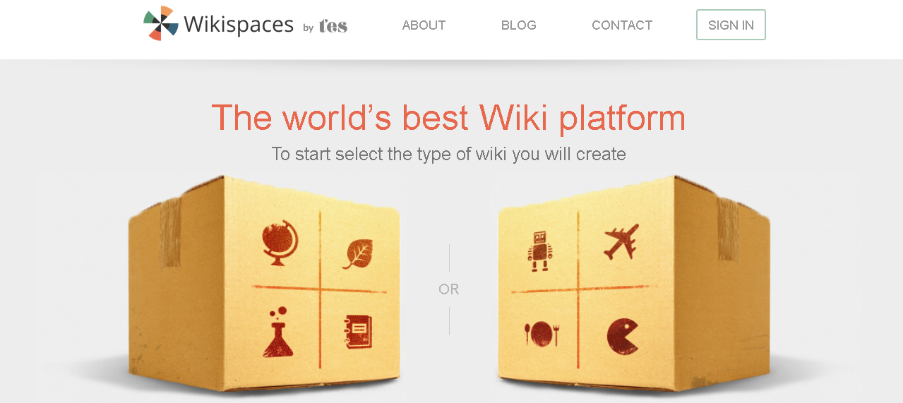
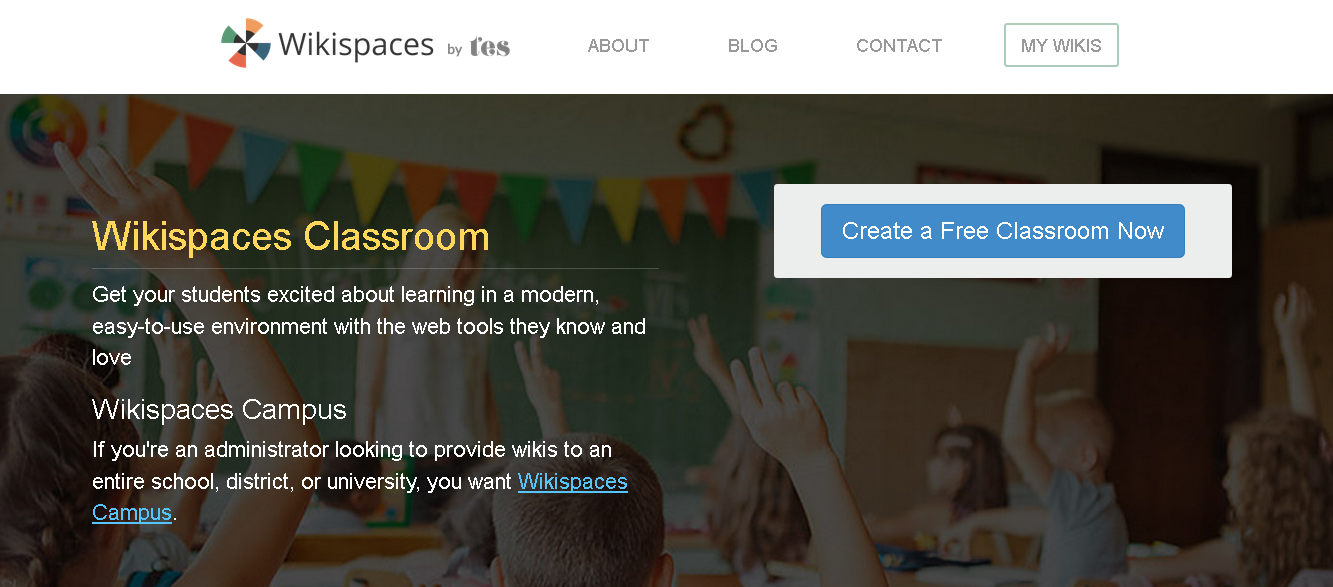
Learnability is the ease with which users learn how to use the website and understand its functionality. A critical analysis of the website showed that the homepage provides guidelines for users to select the web page of their choice with ease from the two options available. After clicking on the education icon, it automatically creates the classroom web page on a new page, which automatically takes one to the free classroom. The classroom page provides a summary of the users’ expectations without providing links to navigate to those expectations such as creating a new schedule and assessing students’ engagements in real-time, among others.

Efficiency
A critical evaluation of the efficiency of the wiki website shows that engagements to the target audience of students happen in real-time (Kessler and Bikowski 5). However, the user must take some time to learn how to use the new classroom before starting to interact with the students (Waddell and Burks 4). However, the webpages can be designed with links that guide the user to a specific task. Besides, each task should be made distinctly separate so that a user does not get confused with many tasks on the same webpage. For instance, creating a new classroom requires the user to know the target audience and get in touch with them (Zhang and Von Dran 29). However, the website allows users to engage in various activities, which makes it attractive to the learning and teaching communities.
Memorability
According to Kessler and Bikowski, memorability is the ease of remembering how to use the system after a period of non-use (10). For instance, a user should remember how to create a wiki after a period of non-use, which is an important system functionality. Memorability can be enhanced by reducing the number of icons on the homepage and providing messages and links to those webpages that a person had already visited.
Errors
The system is not completely error-free because new users find it difficult to create and use new ‘wikis”. One suggestion is to messages that guide new users on how to create a new wiki. Besides, it is slightly difficult for users to interact with some elements which enable them to sign up, find contact information, and share ideas with other users. For those elements that users find difficult to interact with, a link should be provided for a user to click on and ask for help. Some webpages with the help information should only be revealed when a user clicks on their links.
Strengths of the Design
It was established that some learners and teachers found the site pleasant to use (Zaharias and Poylymenakou 9). Some of the positive points that led to user satisfaction include better usability, positive visibility, freedom, real-time responses, and user-enabled control (Zaharias and Poylymenakou 9). The website is visible, clear, properly organized, and uses icons and elements that are easy to use.
User’s satisfaction
User satisfaction is a measure of the extent to which the user finds the system pleasant. Zaharias and Poylymenakou argue that a significant number of users are satisfied with the website (10).
Opportunity for Improvement
The opportunity for improvement includes focusing on creating a user interface for emergency exits when one makes a mistake by clicking on the wrong button to reduce the frequency of making errors. Another opportunity is to enable users to create the right interactive environment, adopt better aesthetics, and minimize the number of elements on the education web page. Also, it provides a mechanism for users to recognize that they have made a mistake and recover from it, and enable user control and freedom.
Recommendations for improvement
Based on the findings from the study, the following recommendations were made: include better visual clarity by assigning links to images for error prevention to enable the users to interact with the website and avoid making errors. Enabling prompt feedback, privacy settings, and providing user control to cancel all operations at one’s discretion were additional recommendations that could make the website more interactive and user friendly.
Works Cited
Agarwal, Ritu, and Viswanath Venkatesh. “Assessing a firm’s web presence: a heuristic evaluation procedure for the measurement of usability.” Information Systems Research 13.2 (2002): 168-186. Print.
Kessler, Greg, and Dawn Bikowski. “Developing collaborative autonomous learning abilities in computer mediated language learning: Attention to meaning among students in wiki space.” Computer Assisted Language Learning 23.1 (2010): 41-58. Print.
Raward, Roslyn. “Academic library website design principles: development of a checklist.” Australian Academic & Research Libraries 32.2 (2001): 123-136. Print.
Waddell, Cynthia, and Michael Burks. Constructing accessible web sites. Vol. 34. Birmingham: Glasshaus, 2002.Print.
Zaharias, Panagiotis, and Angeliki Poylymenakou. “Developing a usability evaluation method for e-learning applications: Beyond functional usability.” Intl. Journal of Human–Computer Interaction 25.1 (2009): 75-98. Print.
Zhang, Ping, and Gisela Von Dran. “Expectations and rankings of Web site quality features: Results of two studies on user perceptions.” System Sciences, 2001. Proceedings of the 34th Annual Hawaii International Conference on. IEEE, 2001. Print.