Executive Summary
Uber and Lyft taxi services are two companies that offer the same service with almost equal measure. This paper seeks to evaluate the websites of the two companies to find out the edge that each has over the competitor’s site. The websites have been evaluated along with a five-point matrix of usability, design, content, trust, and limitations. In this case, the Uber site is the main site while the Lyft site is the competitor’s site. The analysis finds that the Uber website is much more superior to the Lyft website in terms of coverage. Although the use of a website is meant to be global, it also needs to be relevant to the user. Other functions and ratings that are provided for the two companies’ websites give them an almost equal footing, with either of the two winnings.
Introduction
Uber and Lyft are the most popular rideshare companies in the world to date. The two companies have employed the use of electronic media and phone applications as a way of creating an access point for drivers and passengers. The provided rideshare applications on the phone and the general websites are meant to answer any simple question that the customer might have in mind. Therefore, the website, in this case, has been used as the face of the company and the primary interactive tool for both the driver and the client. This paper provides an analysis that compares the strengths and weaknesses of the two companies’ (Uber and Lyft) websites as effective marketing tools for mother businesses.
Website Analysis Criteria
As Chaffey, Ellis-Chadwick, Johnston, and Mayer (2012) assert, websites have become very important when it comes to marketing a product because they provide an interactive medium through which clients can inquire and/or get the service they need at the comfort of their houses. When two businesses offer the same service with an almost equal measure, other additives that make up the business presentation start to count. Before clients settle for a particular website, they consider several elements. According to Carpio (2015), such elements include website usability, key information, the purpose of the business, content, design quality, functionality, customer journey, limitations, and visual appeal among others.
Usability
According to Chaffey et al. (2012), a good website should be easy to use by the customer because it is a tool meant to serve the customer with minimal queries arising. According to Leger (2016), the usability of a website is reflected in the volume of traffic the site generates. Usability can be measured in terms of how friendly the website appears. The website should be in a language that is easily understandable by the majority of users. A good website should be void of technical jargons that are only understood by a few people. This is because they can easily put off potential visitors to the site. Web traffic is very important to a given website because it provides the much-needed feedback to the owners and designers of the site. Bavan’s framework as depicted by Chaffey et al. (2012) provides specific points such as usefulness, yield, and contentment, which should be used in evaluating usability. The elements to be assessed include:
- I can complete errands straightforwardly.
- I can complete errands swiftly.
- I can search for information effortlessly.
- All links on the website are operational.
- I am contented with my general experience on the website.
The assessment of the usability aspect will help Uber in determining areas that are better or substandard to the rival Lyft. The goal is to evaluate how the simplicity of use and direction-finding could be enhanced.
Design
Websites are always designed to attract users and/or make their experience good. The artistic design of a website makes it easy for a user to understand how it works. The design should incorporate elements that identify with the business (Chaffey & Smith, 2013). The design should accommodate the logo, the colours of the company, and information that the company needs to convey. According to Escalas, Jain, and Strebel (2001), the design should allow all elements on the face of the website to exist without impeding all other components.
Different areas of interest and their headings should be arranged in a systematic order. Navigation through the website should lead the user from one point to the next and back without a hitch. The site should be designed in a manner that allows adjustments in a way where updates can be posted easily. Escalas et al. (2001) have defined one of the best design assessment tools, which provide standardised web design areas for evaluation. The areas are as follows:
- The website has a dependable plan across all pages.
- The website’s plan matches the character of the intended market.
- The website design draws the user’s attention.
- The writing is simple to understand.
- The design of the website is well structured.
Content
Content is the most important facet that any website should possess. The content is the primary information that the business wishes the customer to read. The content should be in a simple language that summarises what the business wants to relay to the intended audience. It should be precise and organised in a manner that makes sense while reading. The content should be arranged in a systematic format. Other than the content being organised, it should be relevant to the purpose of the business (Vaidyanathan & Mautone, 2009). Not all information about the business should be posted on the website. There is a need for continuous updating of content material to match any new developments.
Trust
According to Gonzalez, Quesada, Davis, and Mora-Monge (2015), any website should pass the basic test of trustworthiness. Any information that is displayed on the site should be the truth about the situation on the ground. The site should be devoid of any misleading information that is primarily meant to lure customers (Feng, Tien, Feng, & Lai, 2014). Customers visiting the site should be confident that the information available is the absolute truth that they can bank on in their pursuit of service. Some websites have suspicious activities that run behind the scenes. Such websites have malicious intentions of luring unsuspecting individuals to give their information.
Therefore, businesses using websites should provide a guarantee that the sites can be trusted with private information such as bank details. This situation requires enhanced security features to be used for the site. Trust will be assessed using Gonzalez et al.’s (2015) unique framework that captures trust areas that individuals look for in a website. The elements include:
- I am secure when handling this website.
- I trust the website to maintain my data secure.
- I trust that my private data will not be distorted by the business.
- The website offers transaction precaution information.
- I think I can rely on this e-tailer.
Limitations
Limitations on a website are two-sided points that can be viewed on the positive and negative side. Although websites are meant to give information about the business, they are limited by different factors that define their operations. A website cannot capture all the information that all users would want. However, this limitation is usually taken care of by the assumption that certain standard information is what the client would want to look out from a website. According to Arya and Srivastava (2015), a website should meet e-quality standards. Other limitations can be manifested in the ability of the website to handle high traffic without collapsing. For instance, when a certain website is on high demand, the traffic can be overwhelming to the extent that it cannot handle the demand. Therefore, website limitations should be within an acceptable threshold that maintains a website’s core purpose.
Conclusion
The two companies have established websites that have successfully been adopted as a platform for presenting business-specific information. As revealed in the above website analysis criteria, a good website should provide satisfaction to the customers on the expected value of service while at the same time encouraging them to go ahead to procure the service. On the other hand, a poor website can easily put off a potential customer, even if the service to be provided is good.
Competitor Website Analysis: Lyft
Usability
Rideshare company, Lyft, has developed a website for both its drivers and clients for interaction in terms of business. Lyft website is plain and straight forward in terms of the services rendered, including the kind of information a user can look for. Website usability depends on its structure and other functions that are required to make it useful (Ghandour, 2015). Lyft website meets all the expectations that any client might look for. Hence, it can be categorised as usable.
The website has organised the different handles under-specific subheadings that guide a user to a point where they need to be. The number of handles on the face of the website is very few. Hence, a user has to go deeper to find more handles. The main headings are the only ones allowed on the face of the site. The site has handles for different users, which guide the user to a specific area of interest. This plan eliminates a mix of information that can confuse the user.
Trust
Lyft website meets any trust requirements that a website should demonstrate. The site is an online platform that is used for communication and financial transactions. Such a website is usually required to meet stringent federal rules that govern money exchange and privacy laws (Chaffey et al., 2012). Lyft website has been designed on a secure platform that provides high-security cover for any information that goes through it.
The website meets other trust requirements by providing the right information that a client needs. According to Chaffey et al. (2012), misleading information is detrimental to the functioning of a site because it can easily turn clients away. As a rule, a website needs to be attractive enough for the user to be interested in coming back. The website has secured its customers against malicious encroachment from hackers and other malware by employing the services of web security companies. These companies continuously update and monitor the website against any form of invasion using the latest security software.
Design
As Horpedahl (2015) observes, the primary purpose of web design is to provide an interactive platform for the owners and users of the site. The website should be designed with the consumer in mind. Lyft company’s website reveals that it has been constructed with a specific purpose to guide the user by simply scrolling down (Horpedahl, 2015). The face of the site is devoid of too much information that can easily lead to a mix up of information and services. A well-designed website contains primary information that the user will always look for while using the service. It will also have information that might be of great help to the user, just in case he or she is not aware of the applications’ availability. This information can be found on Lyft’s site.
Content
Lyft has developed different contents for its website concerning its services and customer needs. The site has an interactive platform for drivers who wish to join the service and for customers who need to link up with the drivers (Chafkin, 2015). The content of the site is deep enough to provide the user with information with a breakdown of services and the advantages that Lyft offers over other providers.
The content includes the scope of the company’s operations, mode of payment, types of vehicles offered, cost of the service, and/or where to sign up or sign in. As Guo and Han (2013) assert, “the content of a website should strictly be relevant to the purpose it is meant to serve” (p. 417). Irrelevant content drowns the useful information, which the user ends up missing. Lyft site contains other enticing information such as how the company has been rated, insurance cover, and the conditional requirements that come with the service.
Existing Online Value Proposition
Lyft has several online value propositions that make the service what it is. The most important value that the writer identified is, “full disclosure of fares.” The service provides information that the client needs to know, which includes a variance in fare charges in different locations. It is always an assumption that cab charges for a specific company are uniform in all the geographical areas it operates. This assumption does not exist with Lyft because it varies its charges.
The website provides a handle that informs the user if there is a variance in charges from the normal rates. The proposition, in this case, is an honest provision of a service according to the expectation. Rideshare services have become popular and common. This commonality is a source of competition to all players because it now attracts new players to the field. The other online value proposition is the company’s operational information in terms of geographical location. This information satisfies the customer’s expectations.
Overall Rating
The Website has an overall rating of 85%. Many users of the site have given it a 4 out 5 ratings.
Company Website Analysis: Uber
Usability
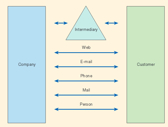
The Uber website is usable. It meets all the required usability values towards the intended users. As a share ride platform, the website has been developed using different languages as a way of accessing other markets. Besides being available through a click of a button, the website is fast enough for use. Being a popular website service, there is a need for instant speed when one is using the service. The diagram below shows the various platforms that customers use to interact with the company.

Uber website’s handles are systematically arranged according to the primary needs of the user. The website has the necessary entry points for either a driver or a customer who wants to use the service. This separation of services enables individuals to access only the services they are interested in pursuing (Chafkin, 2015). The site can be accessed using the computer and mobile phones. Thus, it is handy for individuals in every location. Uber’s handles lead the user to other handles within each section. The site meets standard usability requirements that are necessary for its transactional business.
Trust
Uber’s site provides information about the company. The site is a primary source of information for all users and hence the face of the company. The site provides real-time information about the company’s operations. Any content that is posted is real. According to Horpedahl (2015), trust in a website can be derived from the belief that any information required can be obtained. The site has other social media handles that can be used to send queries to the customer care service in case of queries.
The site can be trusted with the client’s information because it has been designed with consumer protection values in mind. The site meets federal requirements that allow it to transact electronic money transfer. The fact that Uber has grown so much by using a website and other phone applications is a clear testimony that clients have trust in the site. Uber drivers are recruited using their website. Passengers find drivers on the same site.
Design
Website design is meant to capture the users’ attention while at the same time relaying the businesses’ information to clients. The design of a website should include relevant colours, patterns, and other artistic values (Feng et al., 2014). Uber’s website has been designed in a way that allows users to see the most crucial information first such as route charges before they can delve deeper. The site is easy to manoeuvre through as one looks for the right information. A systematic arrangement of the different profiles enables a customer to have a great overview of what the website contains before opening the profiles. The site allows a client to predetermine the fare that they may be charged before booking the service. Other than profile features, the site has a picture background of happy users of the service as shown below.

According to Feng et al. (2014), a website’s design is a great determinant of a client’s continuous interest. Although repeat users tend to ignore design features, first-time users take a particular interest in the way a site presents its features.
Content
A website’s content is its primary value. The communication tool is meant to cut other channels by consolidating important information that needs to be relayed to users. Uber’s content is straight to the point because it provides information to all users of the site to their advantage. The site provides customers with all the information they need to know while at the same time providing drivers with information that they need. It has area maps for each area the driver operates. It also has a provision for making payment services. A rating service enables a client to assess the driver. Such content is important because it provides a platform for new users to evaluate the new service (Horpedahl, 2015). Uber has a catalogue of all cities in the world. The content found on the site is updated regularly to indicate changes that are taking place.
Potential Online Value Proposition
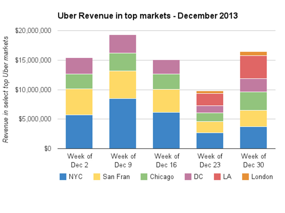
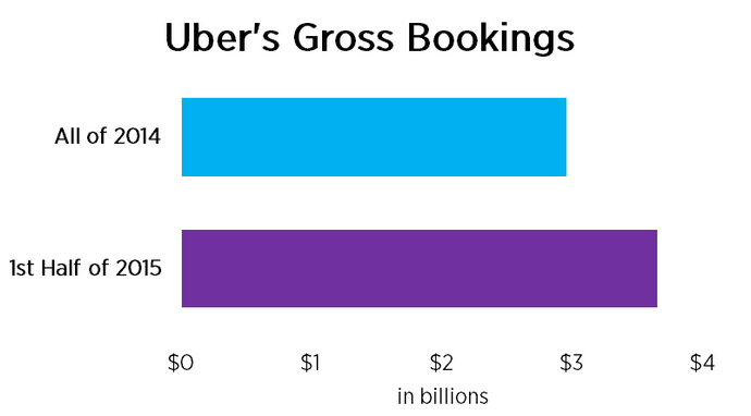
The company has used the Uber website service to inform users about incentives that are on offer. Online service users value the information that a company places on the website. Uber has achieved much because it has become the primary source of interaction among all players. The graph below shows the company’s returns in its major markets.

The service can be used as a mobile application by customers and drivers, thus allowing them the convenience they need. The advantage of having a service on the mobile device has given the site a great value proposition because it does not limit the users of the service.
Overall Rating

Uber has an overall rating of 90% because it stands out as the most popular service in this segment. It has continued to expand its services to many other cities in the world. Therefore, it has a global presence compared to other locally based services.
Comparison of Table
Considerations, Implications, & Recommendations
This analysis report probes and compares how the two websites are working and if they have achieved the requisite standards. Both websites stand out as credible concerning the standards that they are supposed to meet. Although the Lyft site competes favourably with Uber, it has a few deficiencies that need to be addressed by the company. The services of the company should be a true reflection of what the site has proposed. On the other hand, Uber should come up with more innovative services as a way of adding value to what already exists. The concept of rideshare has become common. Hence, the entry of new players will take a share of the two companies’ client base.
Conclusion
Rideshare is a concept that is widely being adopted by many cities as the best way to travel. It can be described as a green process in terms of pollution because it eliminates many cars on the road. As revealed in the paper, the use of a website as the primary tool requires companies to use this service to live up to client expectations because the website is a virtual service. Trust and quality services form the driving force that will sustain this business. Uber and Lyft have confirmed how digital marketing has become an embodiment in the present world because of the way it has been used to the advantage of marketing firms and service providers. The advancement of technology and the use of internet services have seen many innovations that have been successfully adopted to boost business operations.
Reference List
Arya, S., & Srivastava, S. (2015). Effects of user’s primary need on relationship between e-loyalty and its antecedents. Decision, 42(4), 419-449. Web.
Carpio, J. (2015). The value of web design for a smooth sailing customer journey. Web.
Chaffey, D., Ellis-Chadwick, F., Johnston, K., & Mayer, R. (2012). Digital marketing: strategy, implementation and practice. Harlow, Essex: Pearson Education. Web.
Chaffey, D., & Smith, P. (2013). Emarketing excellence: planning and optimising your digital marketing. London: Routledge. Web.
Chafkin, M. (2015). What makes Uber run. Fast Company, 199(10), 110-142. Web.
Clay, K. (2011). Is Uber Really a Good Alternative to Taxis? Web.
Escalas, J., Jain, K., & Strebel, J. (2001). Satisfaction, frustration, and delight: a framework for understanding how consumers interact with web sites. Hersey, PA: Idea Group Publishing. Web.
Feng, T., Tien, C., Feng, Z., & Lai, P. (2014). Web site quality and online trading influences on customer acceptance of securities brokers. Asia Pacific Management Review, 19(1), 25-45. Web.
Ghandour, A. (2015). Ecommerce website value model for SMEs. International Journal of Electronic Commerce Studies, 6(2), 203-222. Web.
Gonzalez, M., Quesada, G., Davis, J., & Mora-Monge, C. (2015). Application of quality management tools in the evaluation of websites: The case of sports organisations. The Quality Management Journal, 22(1), 30-46. Web.
Guo, J., & Han, H. (2013). Analysis and design of programmatic interfaces for integration of diverse web contents. International Journal of Software Engineering & Knowledge Engineering, 23(10), 415-435. Web.
Horpedahl, J. (2015). Ideology Über Alles? Economics bloggers on Uber, Lyft, and other transportation network companies. Econ Journal Watch, 12(3), 360-374. Web.
Leger, P. (2016). The race is on. Fast Company, 204(1), 86-103. Web.
Vaidyanathan, G., & Mautone, S. (2009). Security in dynamic web content management systems applications. Communications of the ACM, 529(12), 121-125. Web.