It’s safe to say that everyone has had to prepare an MS PowerPoint presentation at least once. Nowadays, proficiency in PowerPoint is a fundamental skill. This program is especially useful when it comes to giving speeches in school or at work.

Whether this is your first experience with MS PowerPoint or you just want to learn more about creating a professional and engaging presentation – this article by IvyPanda.com is for you! Here, we will:
- cover the best way to structure your presentation;
- give best PowerPoint presentation tips for students;
- share 7 excellent free templates.
🤔 Your Presentation’s Structure: Why Is It Important?
Whenever you utilize MS PowerPoint, the structure is the most crucial thing to consider. Clearly structured information is easier for the viewer to grasp. And if you accompany your presentation with a speech, a logical structure will help you feel confident, remain on topic, and prevent awkward silence.
💡 How to Structure Your Presentation
A quality presentation always has a message to transfer or a story to tell. It’s divided into 3 parts: introduction, body, and conclusion. Let’s examine at each component in more detail.
Introduction
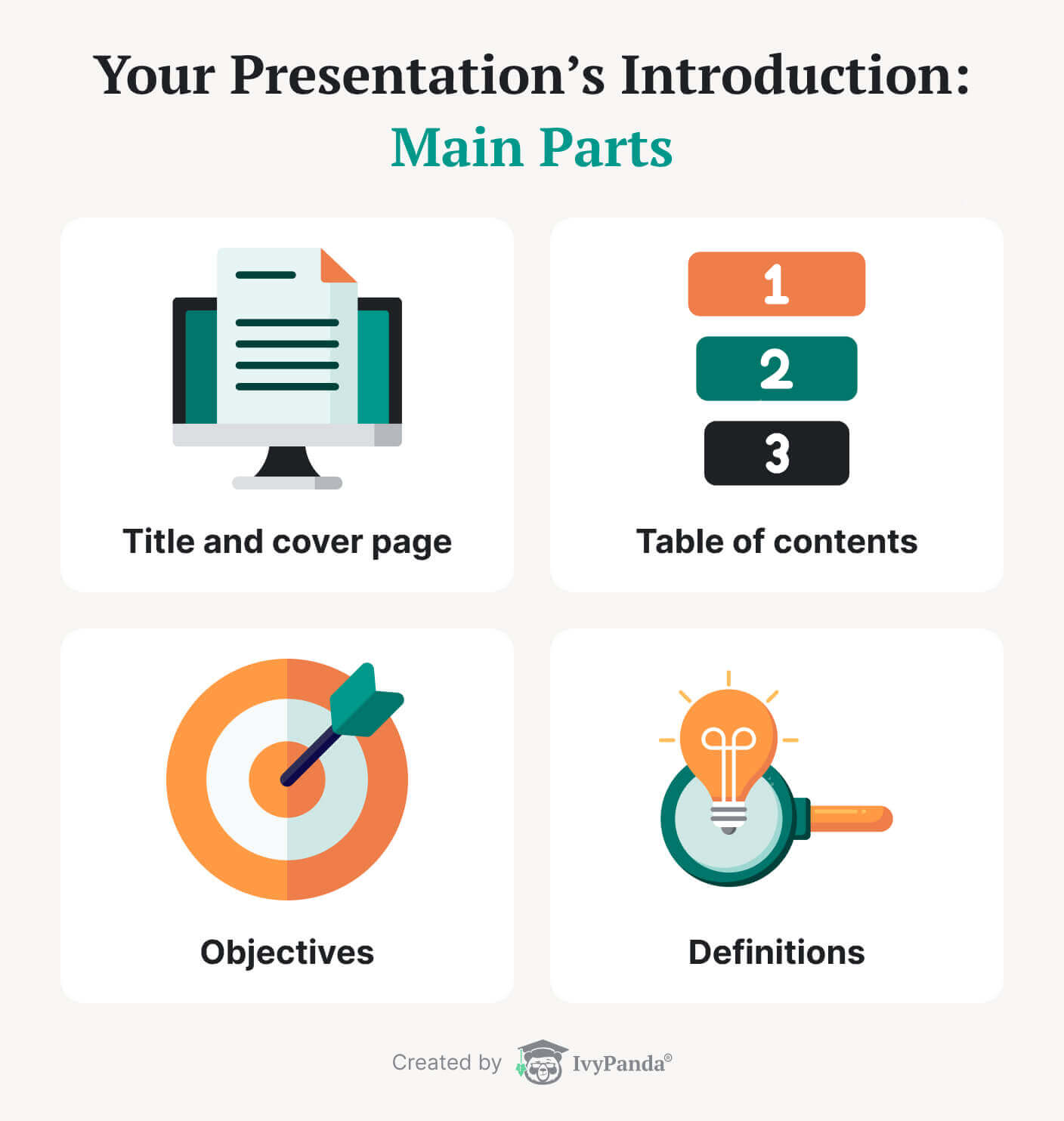
The introduction is singularly the main part of your presentation. It sets the tone for the entire performance and seizes the audience’s attention. Although the introduction takes only about 10-15 % of the overall speaking time, it should be comprehensive and include the following parts:

Title & Cover Page
The cover page is your first slide. Its purpose is to introduce the topic and the presenter. It can also help arouse the listeners’ curiosity in the subject. Invest time in creating a visually pleasing and informative title page, and you’ll definitely succeed.
Want to design a perfect first slide? Follow these simple guidelines:
- Develop a suitable title. Try to keep it brief, straightforward, and descriptive. If it’s impossible to convey the main idea in one heading, use a subtitle to provide further detail.
- Add some info about the speaker. If it’s going to be you, introduce yourself. You might also need to include your student ID, department, or company’s name and logo.
- Work on your cover page’s aesthetics. A well-designed first slide creates a professional impression and shows your effort. Even if you’re not a pro designer, you can create a beautiful opening slide using an MS PowerPoint template.
Table of Contents
Although this component is optional, it’s required to make your presentation impressive. A TOC tells the audience what to expect from the presentation. In addition, a well-organized table of contents makes the structure clearer.
Tracking the slides is even simpler if you add hyperlinks to them. It will allow you to refer back to the required segment immediately when questions arise.
Objectives
When you create a presentation, there’s always an objective: an argument you want to corroborate or an idea to convey. Ensure you state your goals in the first couple of slides. It will let your listeners know what to expect from your presentation and what they’ll take learn from it.
Definitions
Sometimes you need to explain certain words that are unknown to your audience. Creating a slide with the definitions of new terms makes it easier for the listeners to follow your ideas. Make your explanations as simple as possible.
Main Body
The main body is the most informative part of your presentation. It covers all the necessary aspects of your work and determines if your ideas will persuade the audience.
One of the things you want to do while delivering your presentation is to ensure the body is well-organized. A good strategy is to structure the points according to one specific criterion. Here are some suggestions:
- Tell a linear story.
Use narration to deliver your message, from the beginning to the end. - Cover the points in order of priority.
Start by mentioning the more crucial ideas and then move on to the less important ones. - Use a problem-solution dynamic.
Outline a problem, discuss its impact, and offer a solution. - Use a time frame.
You can mention your points in relation to the past, present, and future.
And here are some additional tips to help you create a well-structured main body for your presentation:
- Limit yourself to 3-5 points. If you mention more than five ideas, your audience may get lost, and it will be harder for them to follow your presentation.
- Include smooth and clear transitions between your points. Transitions are another factor that contributes to your presentation’s success. You can use them for an enumeration or count your ideas as steps:
- Make sure your facts are accurate and understandable. It’s essential to have enough detail that you cover the topic comprehensively. And, of course, all your information needs to be credible.
Summary
A summary’s main objective is to outline your presentation’s main points. In this part, you can also suggest sources that can give your audience more information on the topic. Just make sure not to include anything that hasn’t been mentioned before.
Conclusion
The conclusion is a section that ties all the parts of your presentation together. Similar to the introduction, it should be short, straight, and to the point. Here are the best strategies that will help you create a great conclusion:
- Use a short video or an animation to end your speech.
- Mention the references you used for your presentation.
- Follow your performance by answering a couple of questions from the audience.
- And, of course, make sure to thank everyone at the end!
📜 Presentation Text Length: Importance & Strategies
Now that we’ve discussed the structure of your presentation, let’s look at the visual component. It’s vital to present information in a way that’s easy for the audience to digest. If this sounds like a daunting task, don’t worry: our tips will help you ace it.
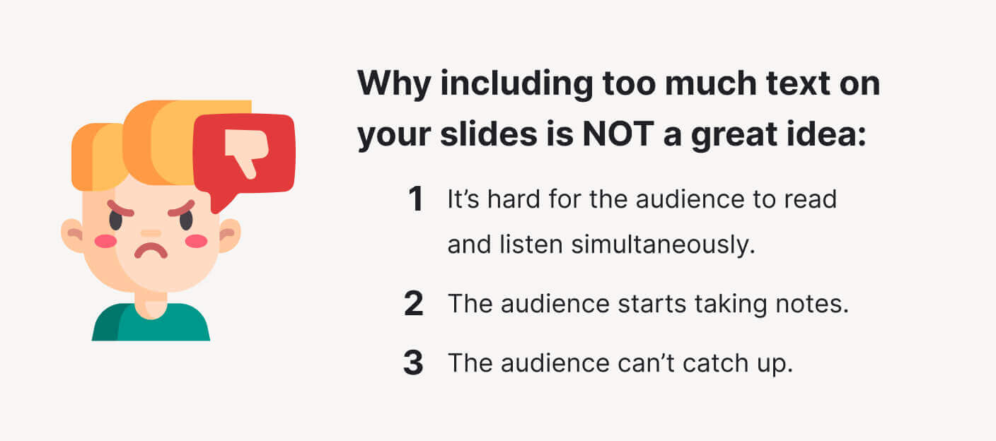
The first rule is to avoid adding too much text to your slides. There are several reasons why you shouldn’t do that:

- It’s hard for the audience to read and listen simultaneously. If there’s too much text, they will stop listening to what you are saying and focus on reading instead.
- The audience starts taking notes. When people come to a watch presentation, they want to learn new things. There are chances that your audience will begin writing down everything that is on the screen because they will assume that the information is essential. It will make them even more distracted.
- As a result, the audience can’t catch up. When the listeners start to make notes, they may fail to notice when you switch to the next slide. It becomes more challenging for them to concentrate on the message and hear everything you say.
Naturally, you want to avoid this nasty situation. We’re going to share the most actionable strategies to help you with that: keep reading!
Use Less Text
Using minimum text is a surefire way to prevent your audience’s confusion. So, how do you do that? Well, there are several ways:
- Limit each slide to one idea. This will help you use fewer words and structure your presentation better.
- Bullet points are very handy. Here’s how to use them efficiently:
- Use them to cover the element of each idea.
- Keep each point to 1-2 lines.
- Use no more than 4-6 bullets per slide.
- Use simple words to describe your ideas.
- Limit the word count per slide. We recommend you use less than 30 words per slide.
Include Images
One of the easiest ways to eliminate excess text is to substitute it with images. Sure, you can’t include pictures on every slide, but there are instances when illustrations are just what will save the day.
If you decide to have visuals in your presentation, ask yourself:
- Are they related to the topic?
- Do they help convey the point?
- Do they make the message clearer?
- Do they present the information you need (in graphs, diagrams, etc.)?
If you answered positively to these questions, then go ahead and use your chosen illustrations. But be careful not to overuse them: they may distract the audience.
🎨 How to Boost Your PowerPoint Design: 12 Best Tips
Now, it’s time to talk design. The look of your presentation is another crucial determinant of your performance’s success. In this section contains the most helpful presentation tips for students that will help you create engaging visuals.
Font Tips for Your Presentation
The font adds character to your slides. Selecting the suitable font ensures that your presentation looks pleasing and competent.
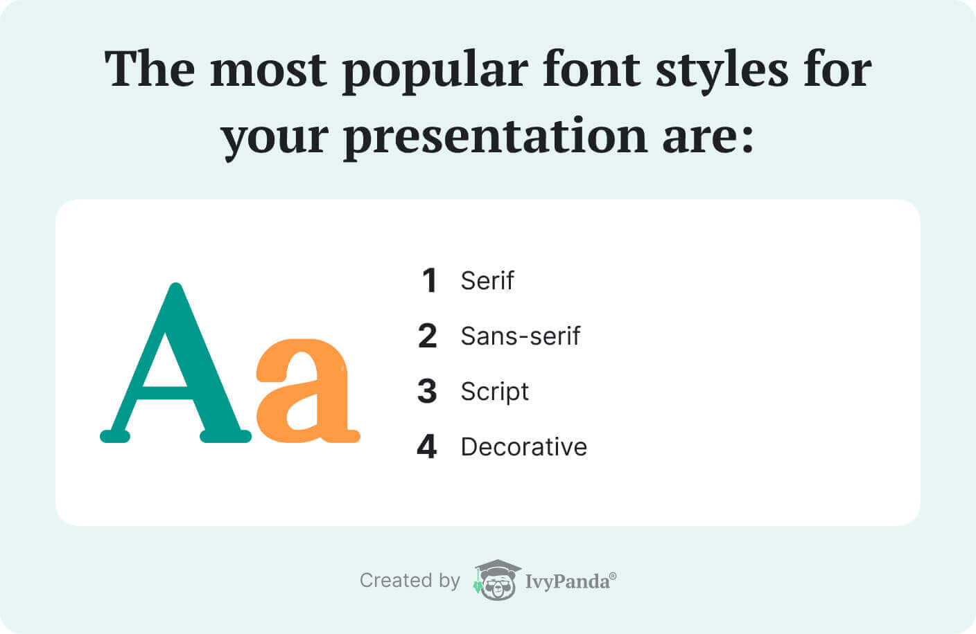
There are 4 main styles: serif, sans-serif, script, and decorative. Each of them has unique characteristics that are worth inspecting:

- Serif fonts have a classic feel. They’re an excellent choice if you are going for simplicity.
- Sans-serif fonts are perfect if you are going for a more modern, rounded design.
- As for script and decorative fonts, they are fancy and stylized. You may want to use them for special purpose presentations.
Here are the strategies to use regarding typeface:
- Choose easily readable fort styles. Popular examples are Arial, Tahoma, Veranda, Garamond, and Times New Roman.
- Standardize the font. Make sure it’s uniform throughout the slides.
- Mind the size. Use size 40 points for the headings and 32 points for the subheadings. Avoid typeface smaller than 24 for the content text.
Color and Contrast Tips
The choice of color may seem inessential, but it’s definitely worth considering when working on your presentation. To choose the perfect color scheme for your slides, keep several things in mind:
- Use harmonious colors. If you want to make your presentation visually pleasing, you can pick complementary, triadic, or tetradic colors with the help of the color wheel.
- Use a high-contrast color scheme. Sometimes there’s not enough contrast between the shades chosen for the text and the background. To be on the safe side, choose lighter colors for the text if you have a darker background and vice-versa.
- Keep it simple. Even though using a variety of shades may be tempting, it’s still best to keep things simple and choose only primary colors.
Animation Tips for Your Presentation
Now let’s turn our attention to animation. Animated elements can make your presentation more engaging or serve as a distraction. So, be wise when incorporating animation into your work. Here are some suggestions:
- Use subtle animation. For instance, you can make the points appear on the screen one after the other. It will give the audience more time to read and digest the information.
- Make objects disappear. Effects such as removing separate elements from the slide can make your presentation more exciting.
- Don’t shy away from simple animation. Sometimes even the most common effects like zoom or fade can help emphasize a certain point. Besides, they are less distracting compared to more showy effects.
- Avoid using too much animation. An overabundance of visual effects will make your presentation too hard on the eyes and distract the audience.
- Don’t go overboard. Stick to a couple of animation effects throughout the whole presentation.
✨ 7 Best Free Templates
If you are new to PowerPoint or don’t have much time to work on a layout, you can always use free templates. We’ve compiled our favorites in the list below. These templates will help you organize your content and ideas in a way that suits you best:
- Group project presentation (Berlin themes, widescreen)
This group project template is designed with teamwork in mind. It’s perfect for you if you’re planning to delegate the parts of your presentation for different team members to complete. With this template, each member gets a set of slides with a coordinating sample chart, a table in a 16:9 format, and SmartArt. - Rainbow presentation
This template is perfect for creating an outdoor-oriented presentation. It is already formatted, so all you need to do is start editing. - General Purpose Thin Style PowerPoint Template
This template will help you create a presentable company profile. It includes editable text areas, infographic icons, and high-resolution replaceable images. - E-Learning Presentation Deck
This presentation template focuses on internet education. It contains 20 slides for online education. It will help you introduce courses, teaching plans, and methods. - Social Media Map Users Free PowerPoint Template and Keynote
This template shows a world map and social media results. It can be used in your report to visually present information regarding your research question or the data you’re using. - Product Design Template
This template is created specifically for startups who wish to present their project and company profile. It includes 20 blue-themed slides and features such as SWOT analysis diagrams, pie diagrams, sales analysis charts, etc. - Member Profile Slides
These are team introduction templates that include placeholders for text, data reports, and photos. This template is perfect for introducing one person.
😃 Bonus Tips for an Effective Presentation
Finally, we want to share additional pro tips for creating an excellent presentation in PowerPoint for students:
- Start with an outline. Think about the content of your presentation before starting to work on the design. It will allow you to effortlessly structure your slides. Grab sticky notes, jot down your ideas, and move them around to see what sequence works best.
- Turn off the pointer. The pointer randomly appearing on the screen during the presentation may distract the audience from the speaker. You can avoid it by hitting the Ctrl-H key combination before starting the slideshow. In case you require the pointer at some moment during your speech, press the A key to have it reappear.
- Have extra slides at the end of your presentation. Having at least one identical copy of your last speaking slide is best. If you accidentally advance to the next slide at the end of your presentation, your audience will never notice. You may also include slides that have answers to the queries you anticipate.
- Blank the screen. Hide the screen temporarily if you want to have the audience’s full attention. You can do this by adding a black image to your slides or pressing the period key. To make the slide reappear, press the period key again.
- Draw on the screen. Drawing on the screen may be handy for explaining difficult ideas visually. Press the Ctrl-P key combination to display a pen on the screen. Press the E key to erase what you have drawn and the A key or the Ctrl-H key combination to hide the pen.
Thanks for reading our article! We hope our tips and strategies will help you create fantastic presentations. Feel free to share your thoughts and ideas in the comment section below.
🔗 References
- Parts of a Presentation: Oregon State University
- How to End Your PowerPoint Presentation with a Strong Close: Envato
- PowerPoint Presentation Guidelines: McGill University
- Part 2: Design Principles: Purdue Writing Lab
- Teaching with PowerPoint: Northern Illinois University
- Writing a PowerPoint Presentation: George Mason University
- PowerPoint Presentations: MIT Alumni Association
- Design Tips for PowerPoint: UNSW
- General Guidelines for PowerPoint Presentations: Virginia Tech
- Tips for Creative Effective PowerPoint Presentations: University of Nebraska–Lincoln

![227 Amazing College Persuasive Essay Topics & Speech Ideas [Free]](https://ivypanda.com/blog/wp-content/uploads/2020/10/teenager-student-girl-over-yellow-pointing-finger-to-the-side-309x208.jpg)
![193 Sports Persuasive Essay Topics [with Tips & Examples]](https://ivypanda.com/blog/wp-content/uploads/2020/10/sport-composition-with-modern-elements-309x208.jpg)
![Top 257 Good Persuasive Essay Topics [Tips & Prompts]](https://ivypanda.com/blog/wp-content/uploads/2020/11/1students-posing-and-coworking-on-white-background-309x208.jpg)
Hello ivypanda.com webmaster, You always provide great examples and case studies.
We are glad to hear your opinion! Thank you, Anke!
Hi ivypanda.com admin, You always provide in-depth analysis and understanding.
Thanks for the awesome feedback, Lauri!